*Winner of a GDUSA 58th Annual American Graphic Design Award
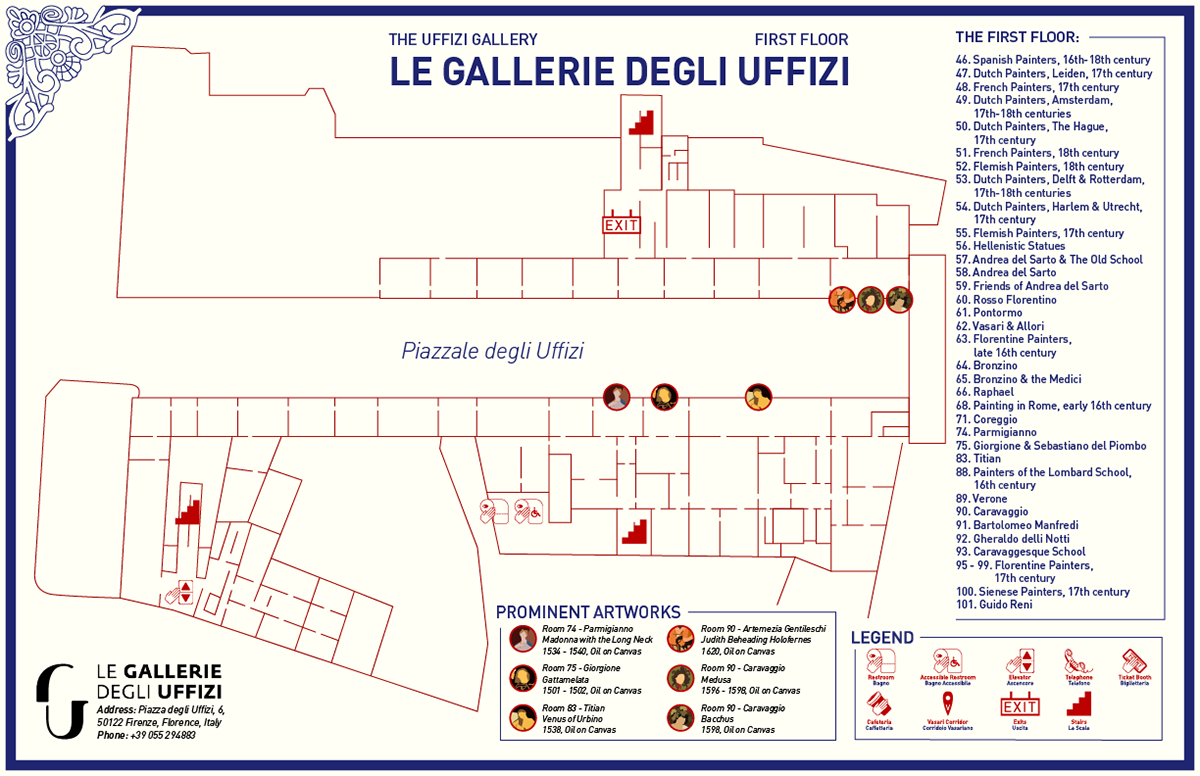
As our third and final project in the Typography and Information Design class, we were asked to choose a real-world location and create a map in order to solve a design problem. Created during the second semester of my Sophomore Year at Pratt, this map aims to be a pleasant and engaging, yet clear and concise way for visitors of the museum to get a good look at the beautiful artwork it holds, all while learning more about some of its most famous pieces. The list of prominent artworks pair with Painting Collectibles scattered around the museum, which can be found and kept by visitors who choose to read the map and/or complete the set.
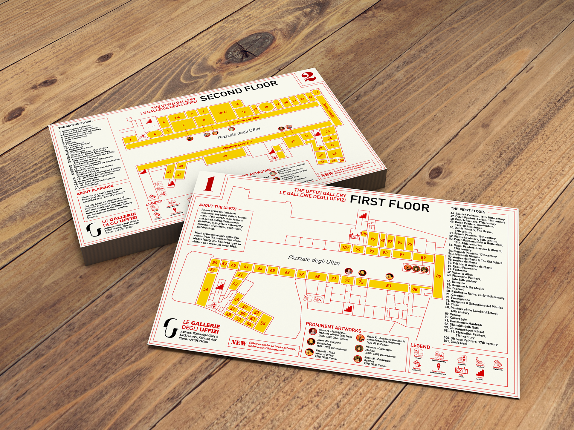
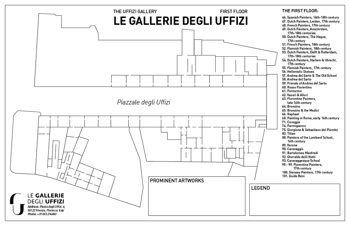
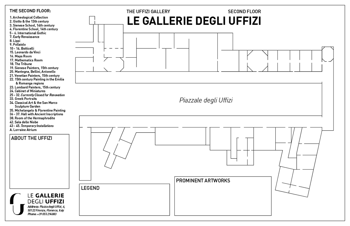
Mockup of the 'Map of the Uffizi Gallery'
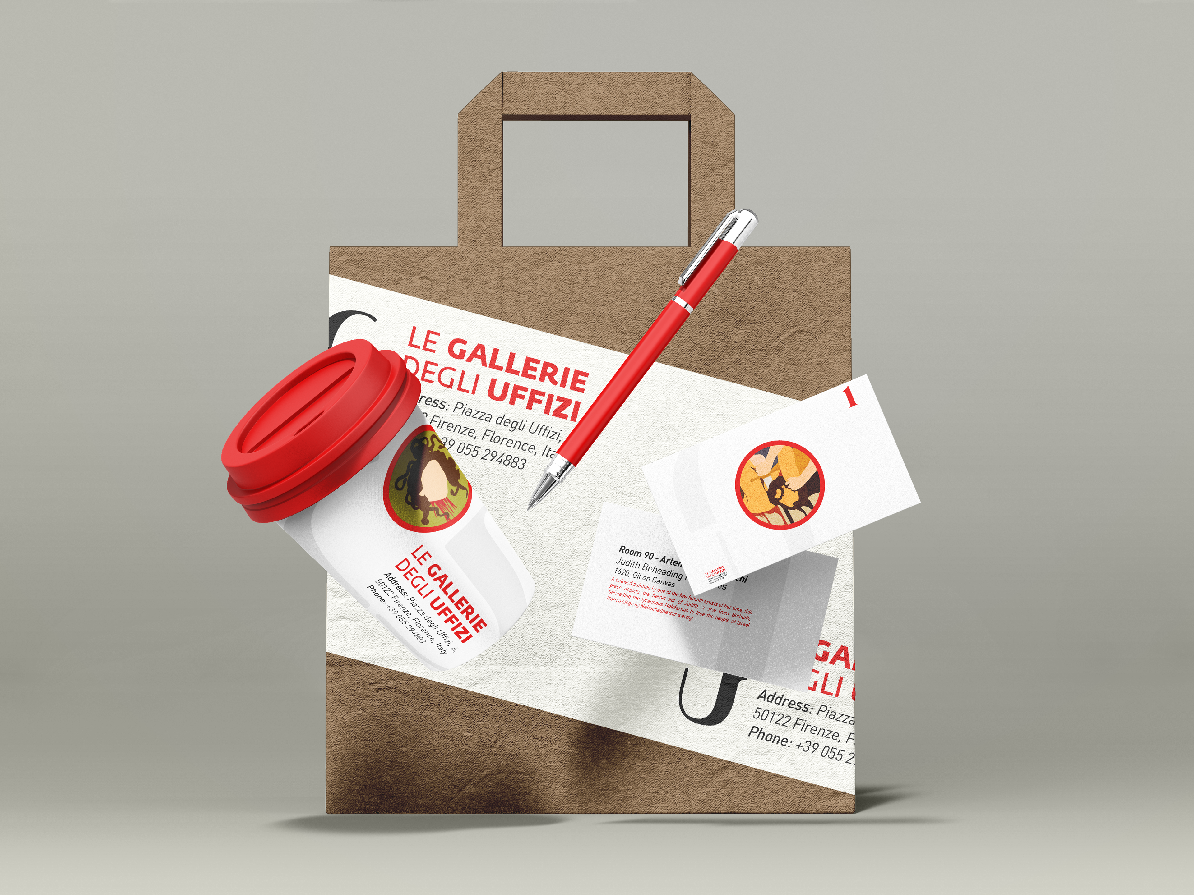
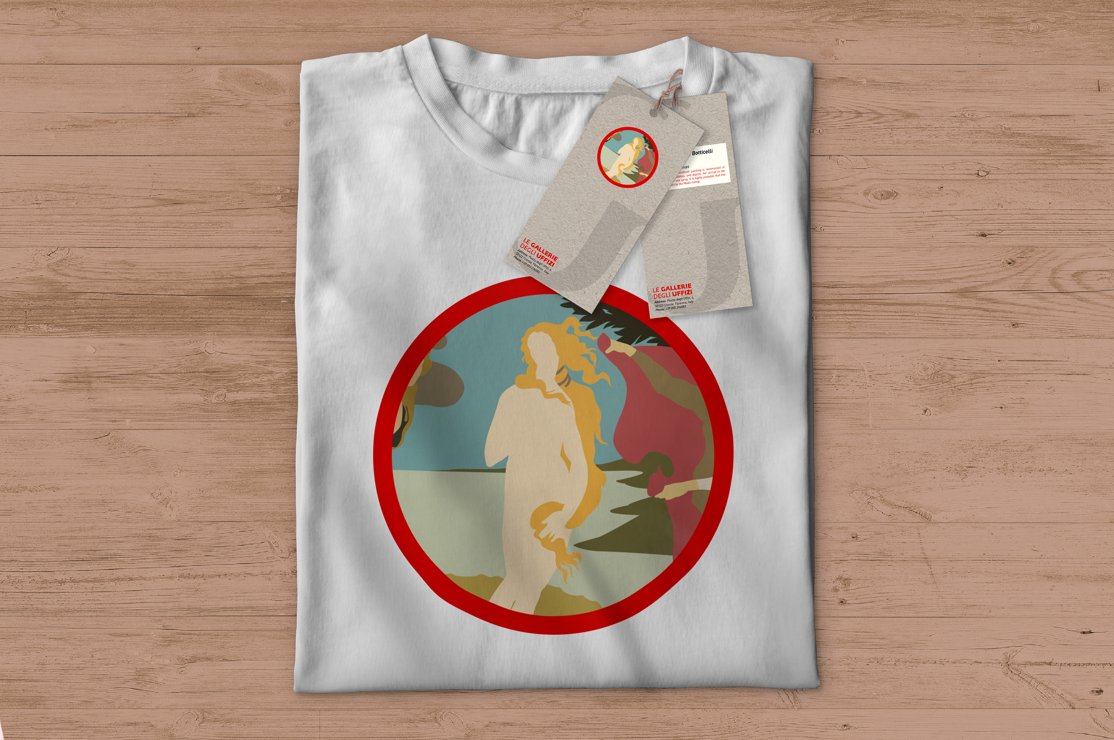
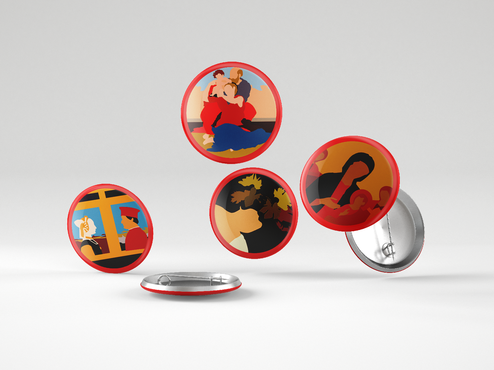
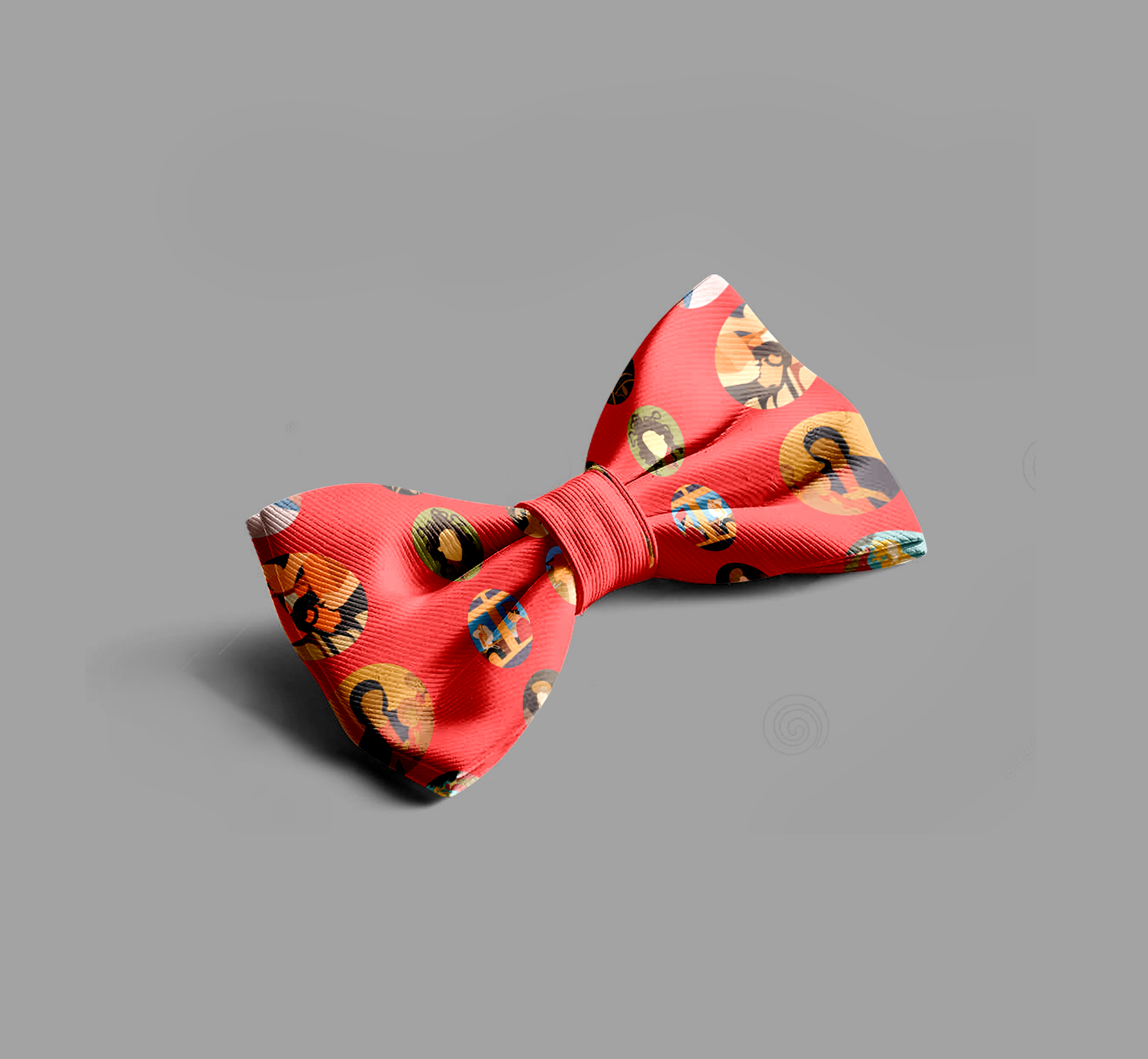
Mockups of Painting Icons as various pieces of possible merchandise for The Uffizi Gallery
PROCESS 1: BRAINSTORM, TOPICS, & CREATIVE BRIEF
Once I had brainstormed, I felt that I had a clearer idea on what I wanted to base my map on, and had to decide between The Uffizi Gallery and The Louvre. I ended up choosing the Uffizi Gallery due to two main reasons:
1. The Louvre is an impossibly large gallery that cannot possibly be mapped out on a single page. It takes hours to go through even one section of the museum, and I doubted that it would be a good use of my time to map out something that wouldn’t be used for its practical purpose.
2 - While The Uffizi Gallery already has maps for each of its floors, they lack any sort of creativity. I would like to design a map that includes the beautiful art that is displayed within, rather than making a cold map that looks like it belongs on the back of a hotel room door.
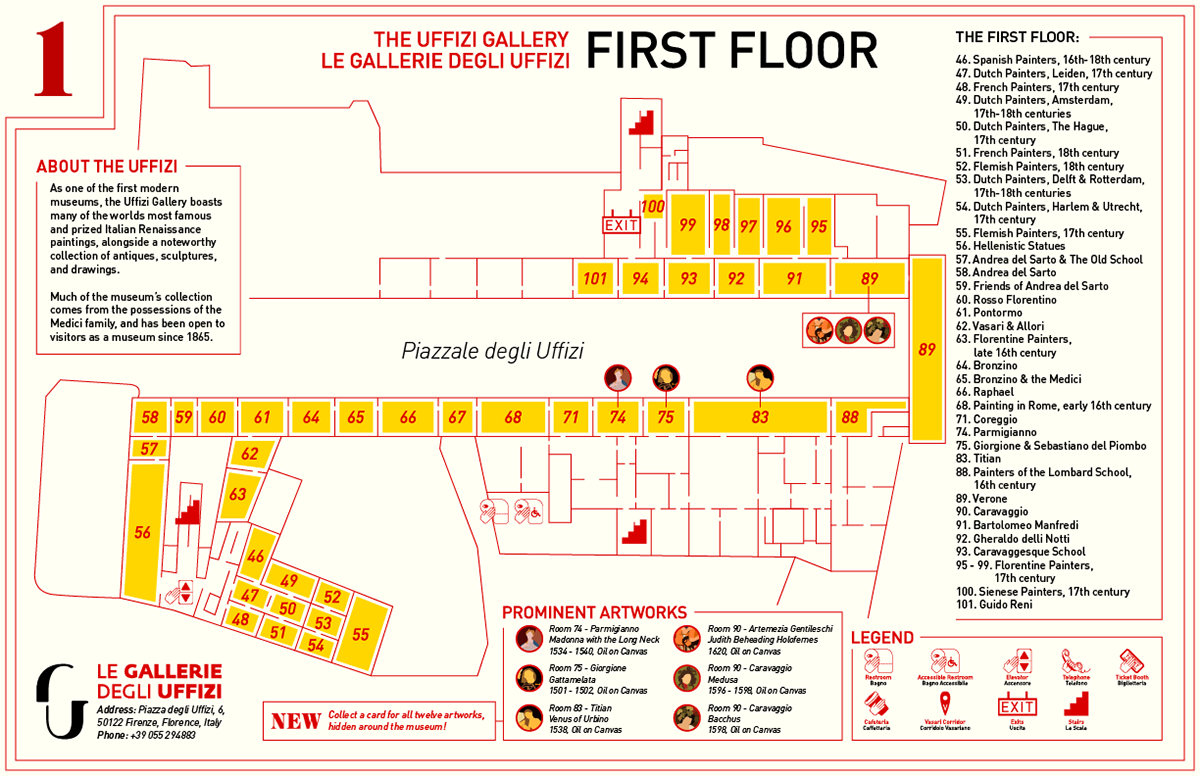
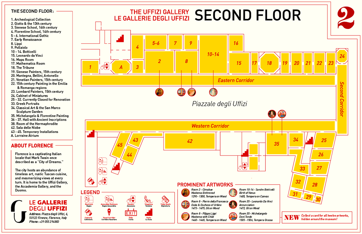
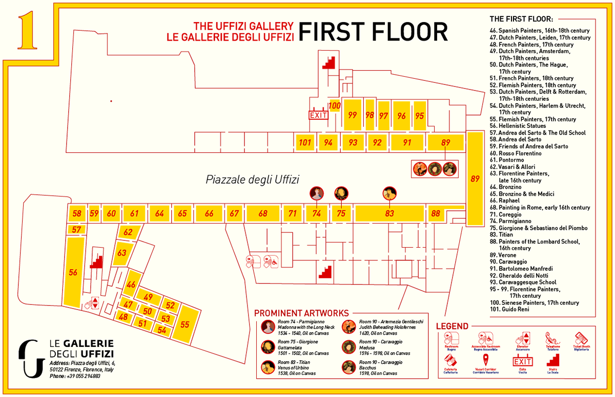
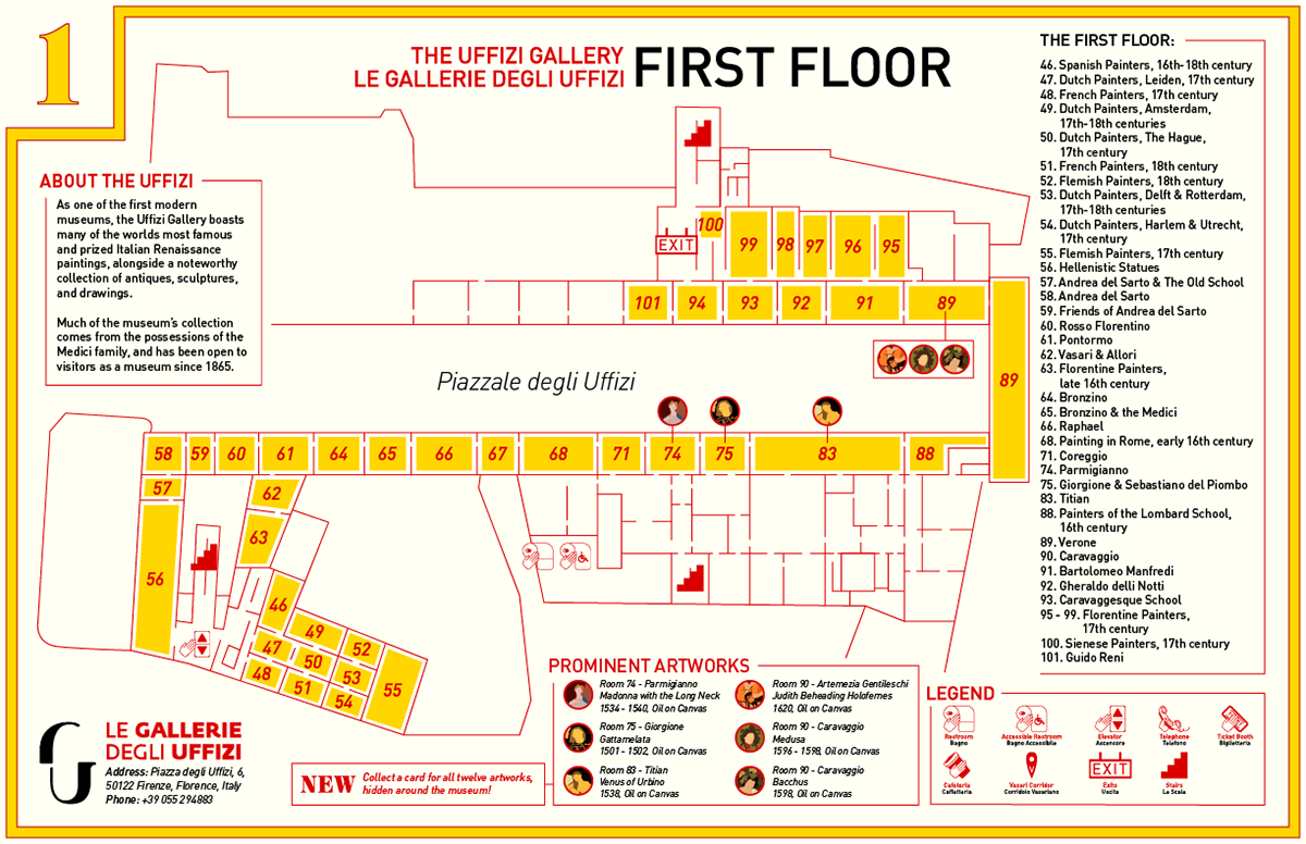
The Uffizi has 3 floors total, 2 of which hold the artworks, but for the purposes of this project I will be focusing on only the first and second floors, as it has the most number of pieces that I remember seeing and want to include in the map.
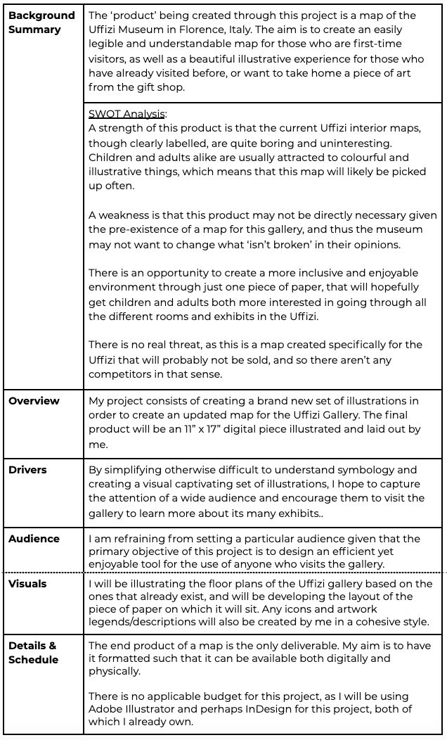
The main issues I found with the Uffizi map when I visited, and an issue I find with a lot of museums, is that, for an art exhibit, its branding is rather uninspired, boring, or simply bad. In the case of the Uffizi, while the maps are clear and give the information they need to, they are extremely technical, and lack all of the artistic wonder that the rest of the museum garners.
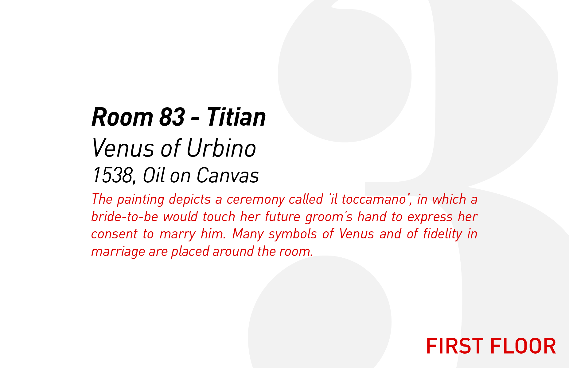
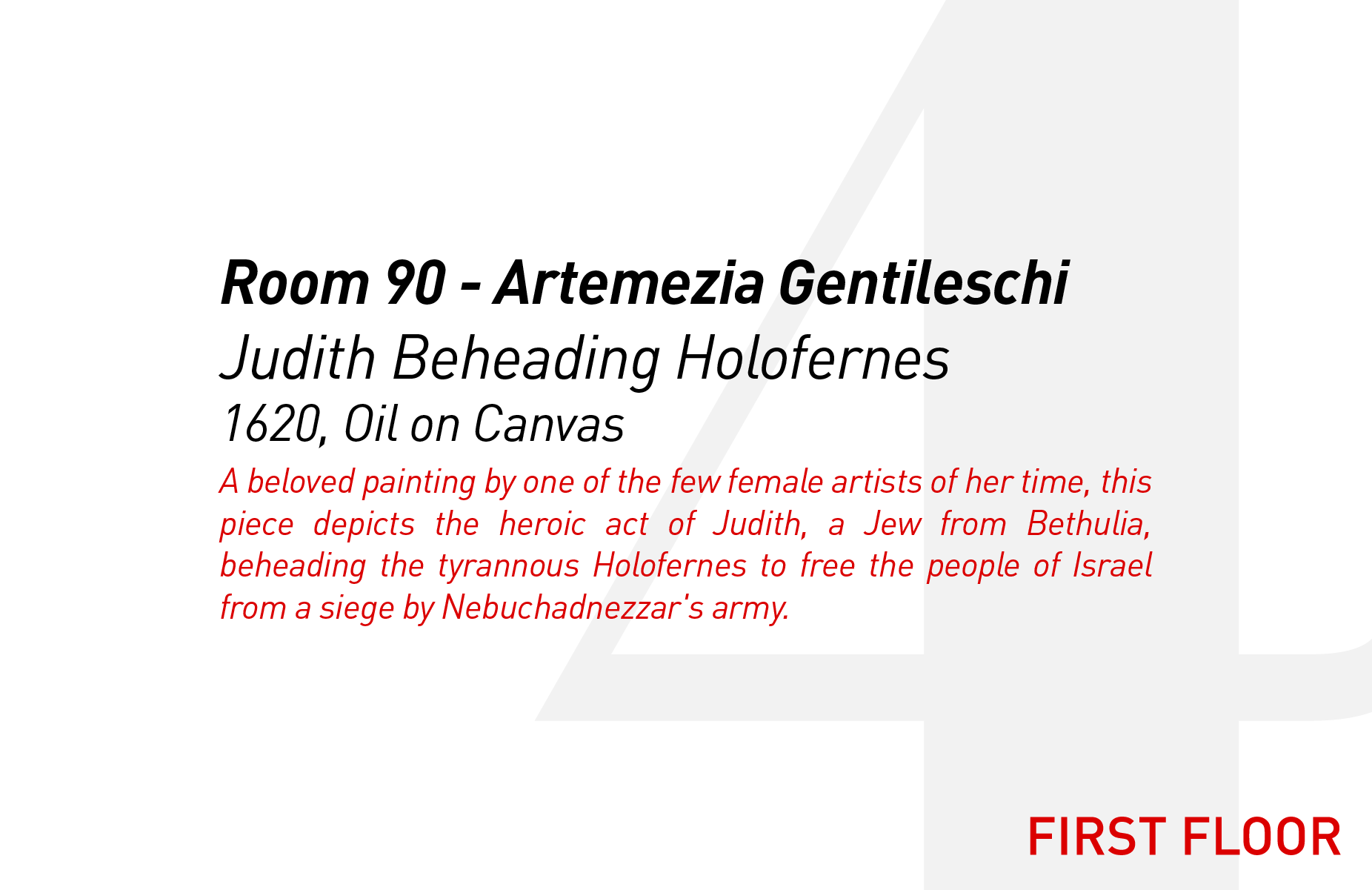
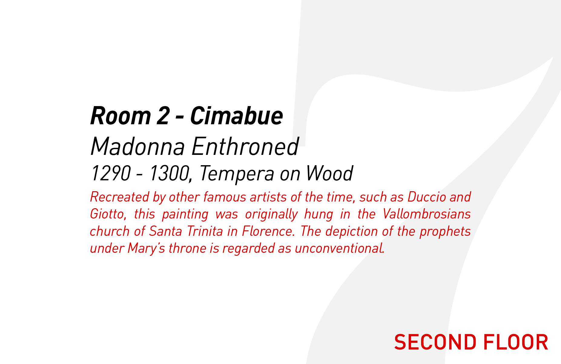
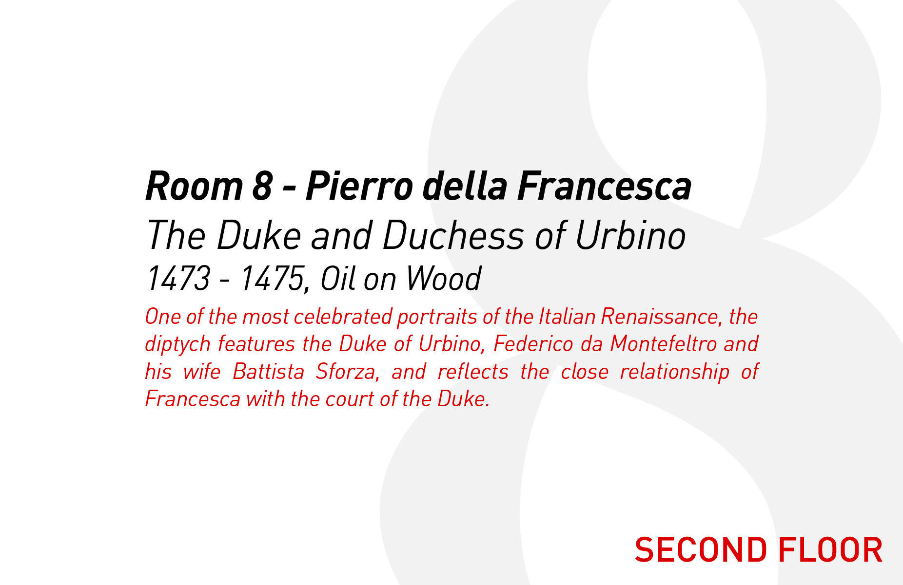
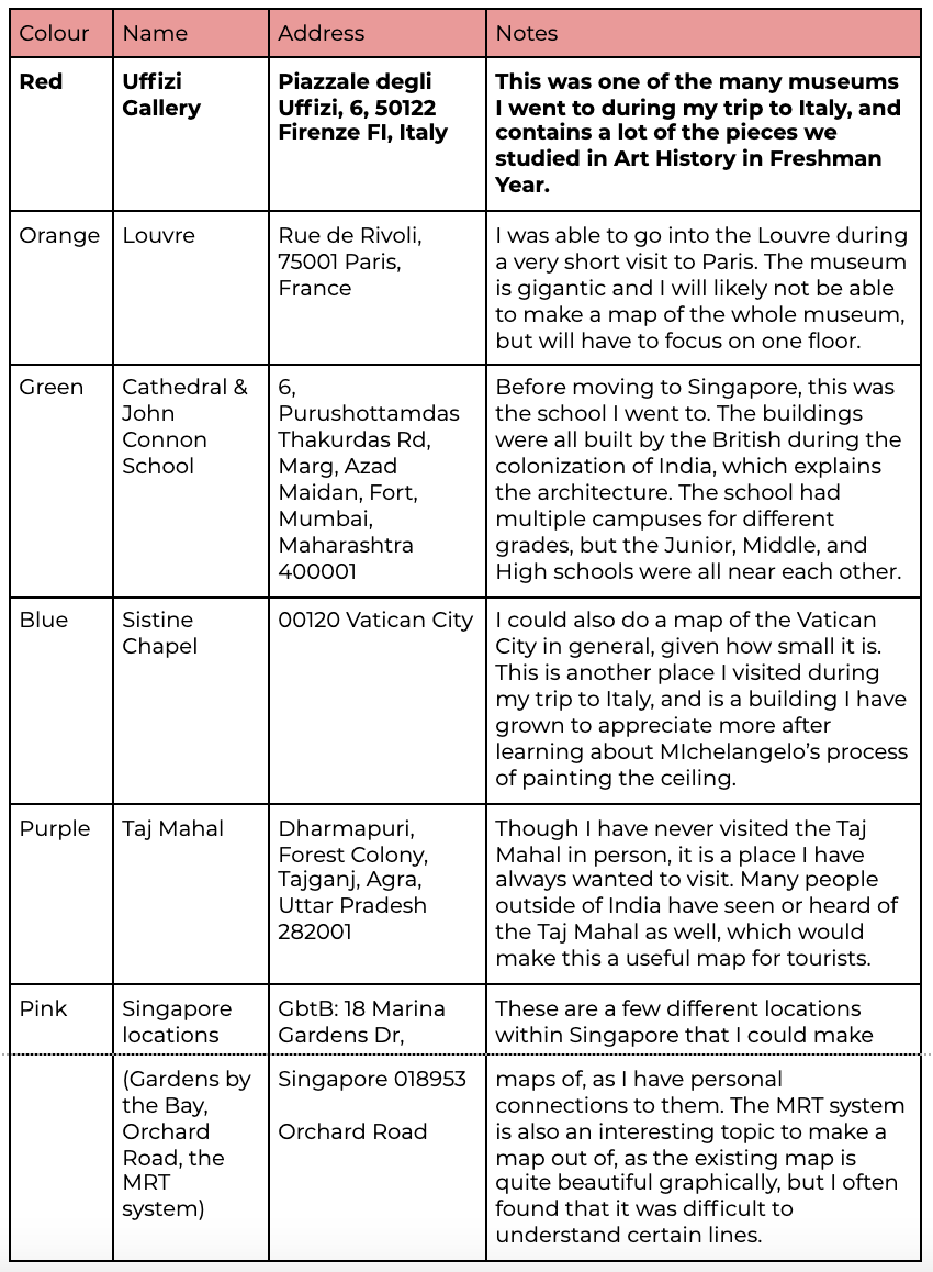
I have a book cataloguing the history and context of all the works at the Uffizi, which I had purchased during my visit, and this will be my main source of information. The book will be very useful when I am choosing which works to highlight, as well as for writing brief descriptions for each of them.
PROCESS 2: RESEARCH
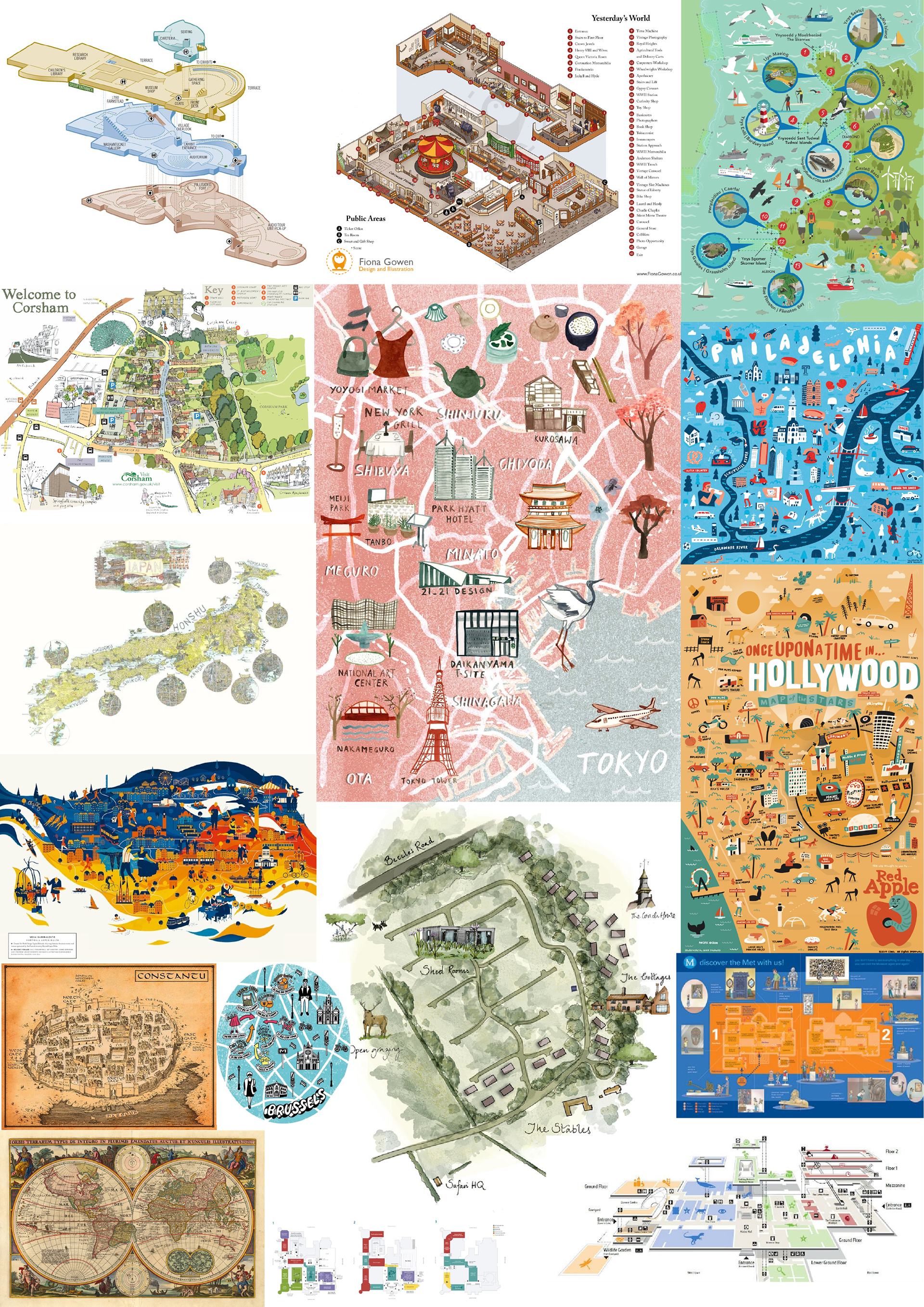
The first page of my visual research (above, left) consists of maps illustrated in different ways, illustrations of museum maps that I do like, as well as more archaic inked maps of the world that were developed centuries ago. This page was largely exploring the overall idea I had of creating a museum map, as well as the different styles in which others have tackled the illustrative aspect of maps, be they for cities or buildings. I am most drawn to the style of the red Tokyo map in the middle, as it has one main colour that isn’t too loud or too dull, and sticks to a cool colour scheme throughout.
While I do like the illustrations in the ‘One Upon a Time in Hollywood’ and ‘Philadelphia’ maps (on the right side), they seem a little too loud for what I was envisioning, but are still good sources of inspiration regardless. The 3d floor plans on the top left of the page is something I might want to include a small version of in the corner of my overall map page, as I feel that it is a good artistic yet logical representation of the museum as a whole.
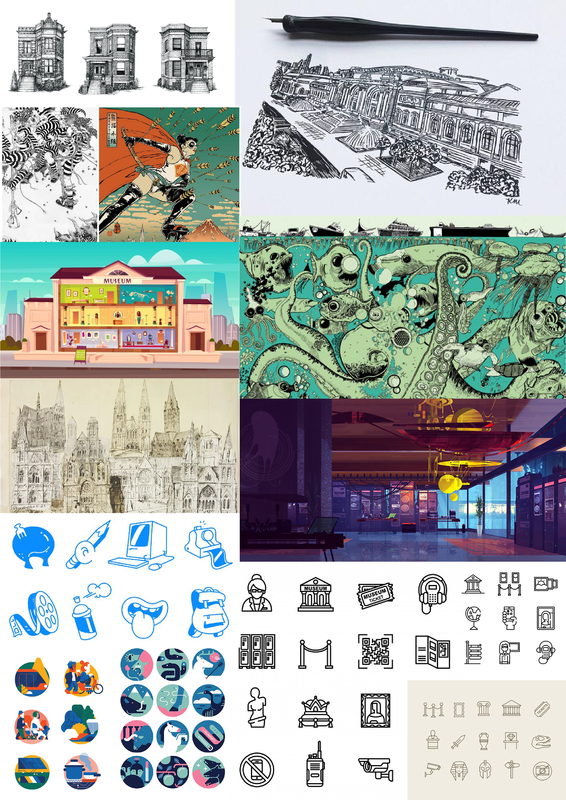
The second page of my visual research (above, right) is more focused on the styles I want to explore, and have liked in my own experience. I do very much enjoy ink drawings of architecture, and it is an avenue I am considering going down. On the other side of the spectrum, I also included a photo from the ‘Spiderman: Into the Spiderverse’ Art Style book, which I bought recently and found incredibly beautiful. The simple shapes used to create many of the beautiful animations really inspired me, and that is another way I am considering showing my map.
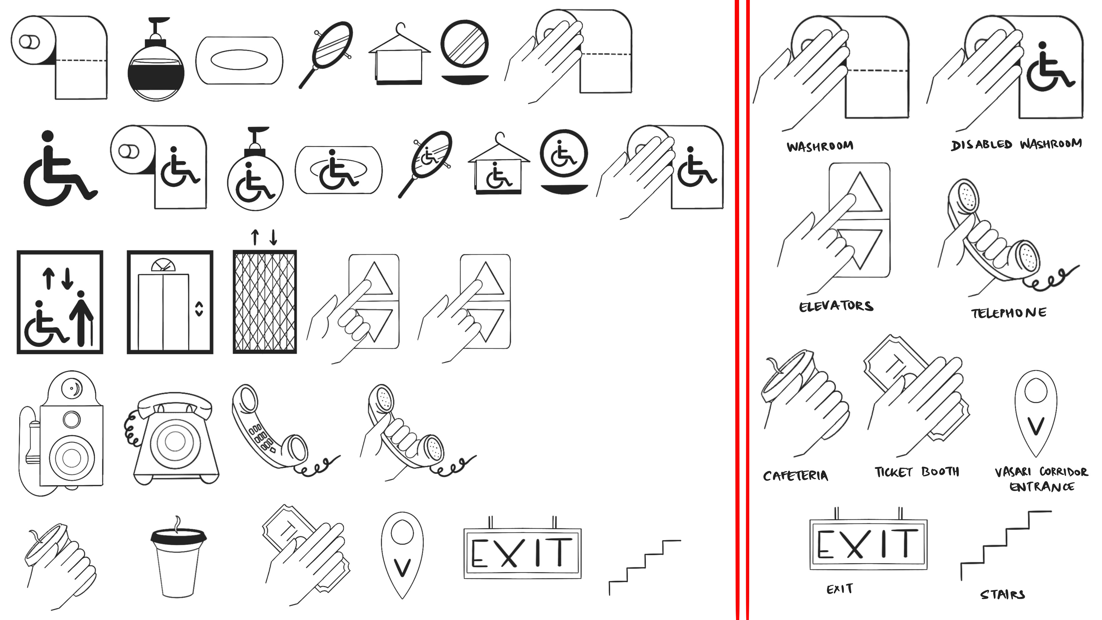
Lastly, I explored different icons. On the bottom left of the second page (above, right) are examples of illustrative icons. I want my icons to be both illustrative and simple to understand, which I will likely do by sticking to just one colour from my colour scheme. I also want to consider including the Italian names of all the icons, as the Uffizi is in Florence, Italy, and it is important that English isn’t the only language being used in Italy. One thing I definitely want to tackle is how bathrooms are represented - I don’t feel it is apt to use the gendered male/female icons, and would rather find a different way to show these. The icons on the bottom right are more specialized to museums, and are in a similar style to that which I want to do my map in.
I will likely go with the toilet paper idea, as it is a very recognizable and obvious, yet gender-neutral way to represent restrooms.
I also definitely want to design icons for accessibility, be they wheelchair access ramps and bathrooms, braille guides, and other such things that will help the disability community when visiting the museum. It is likely that this may result in me needing to redesign part of the map, while I am completely okay with doing. While this may not be possible within the scope of the project, it is definitely something that is important to remember. I will admit that I wasn’t too conscious of making my artworks accessible before (although I don’t think any of them weren’t), but am now more aware of the different ways in which I can improve my design so it addresses the needs of anyone who may use it.
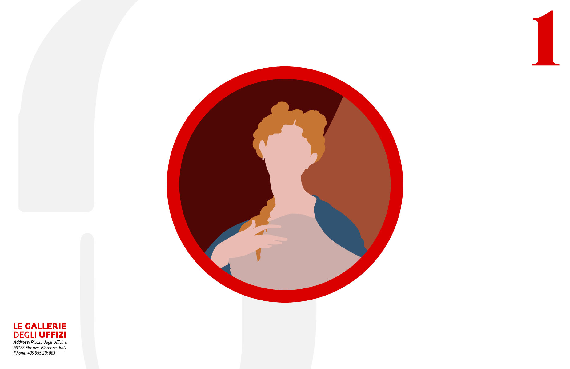
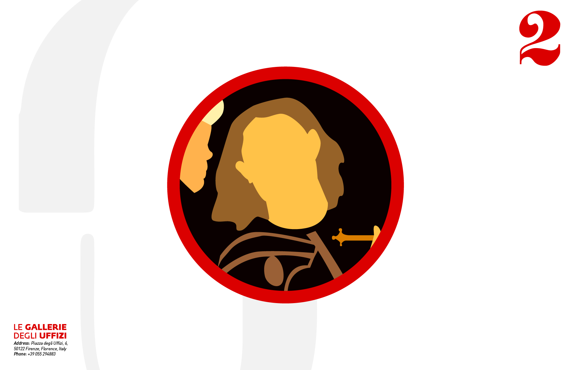
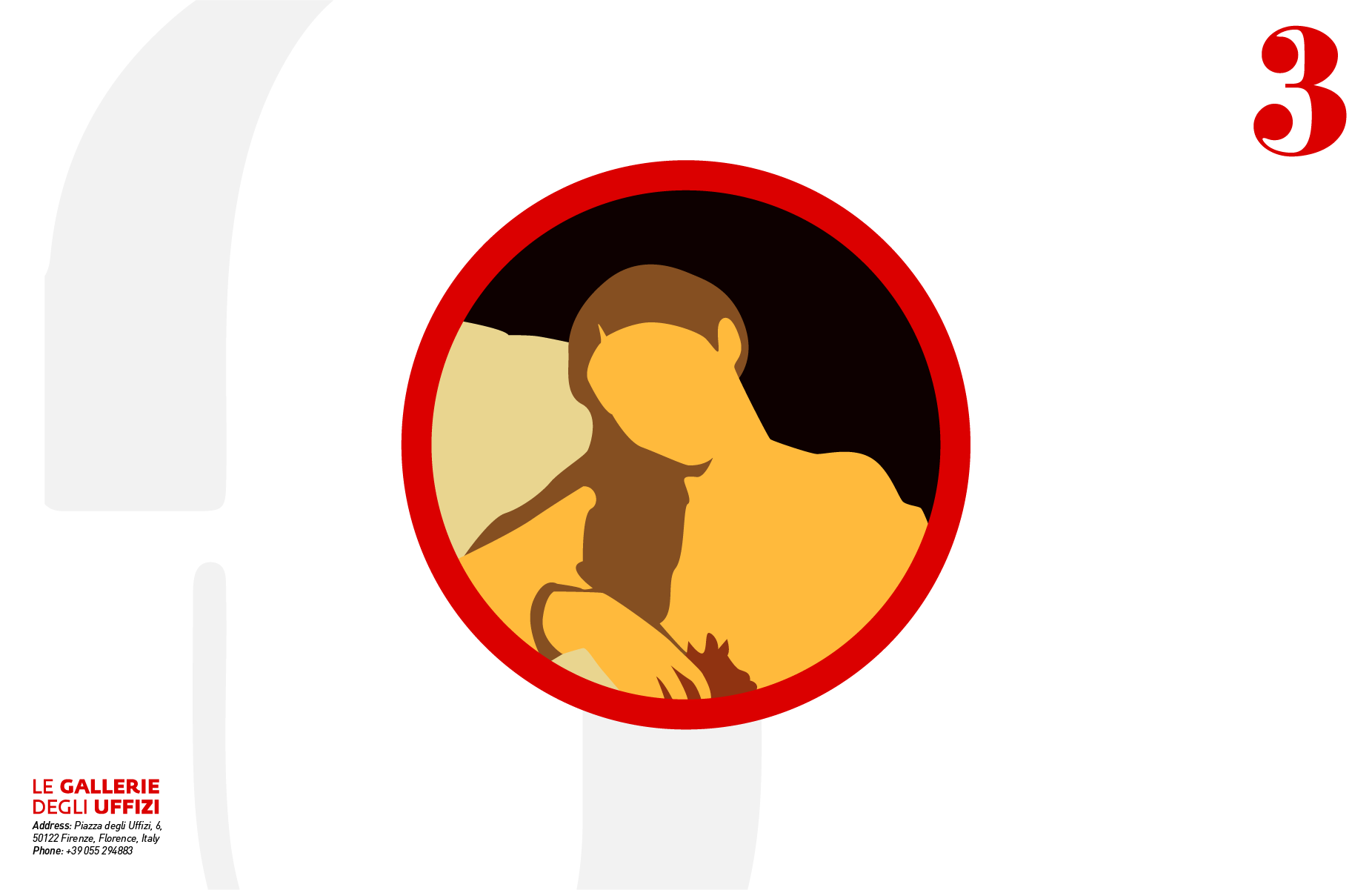
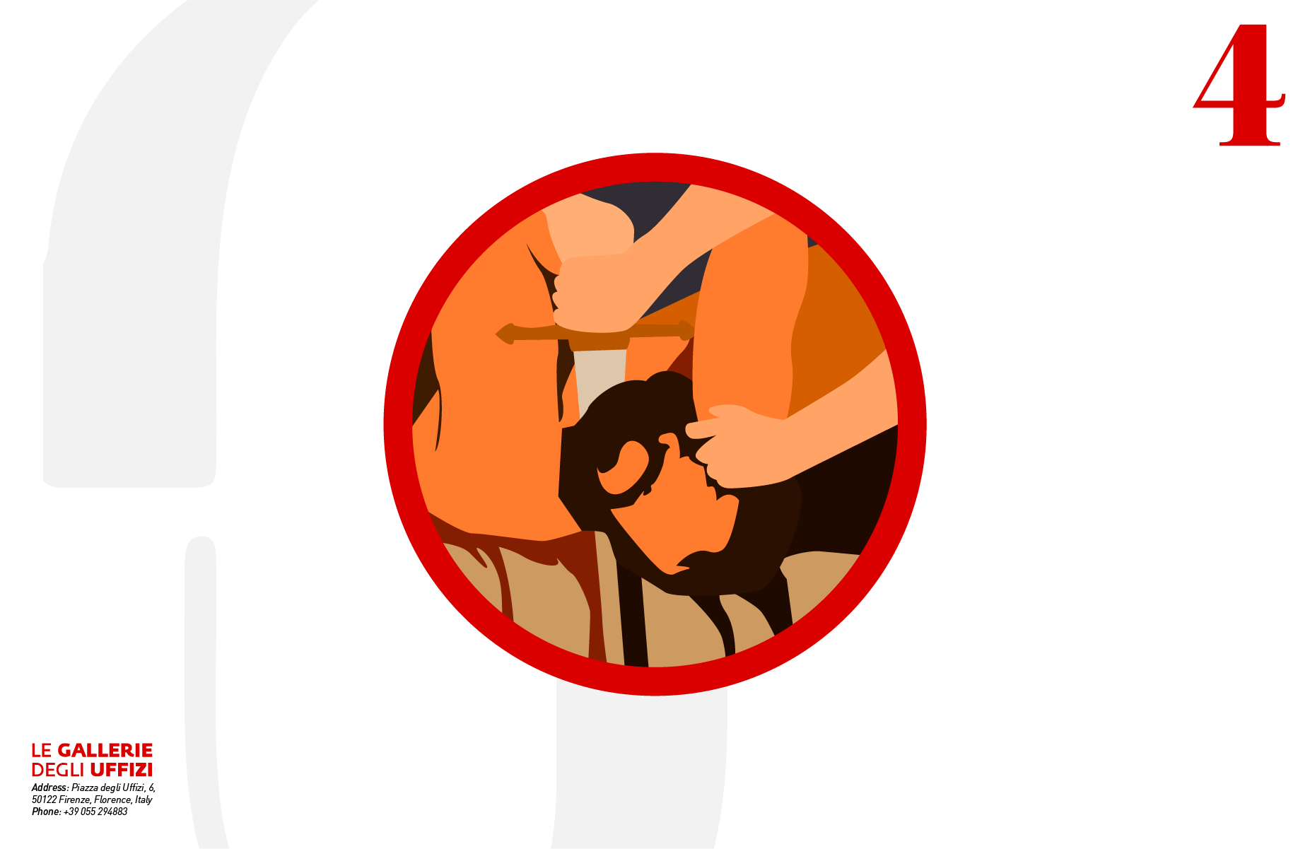
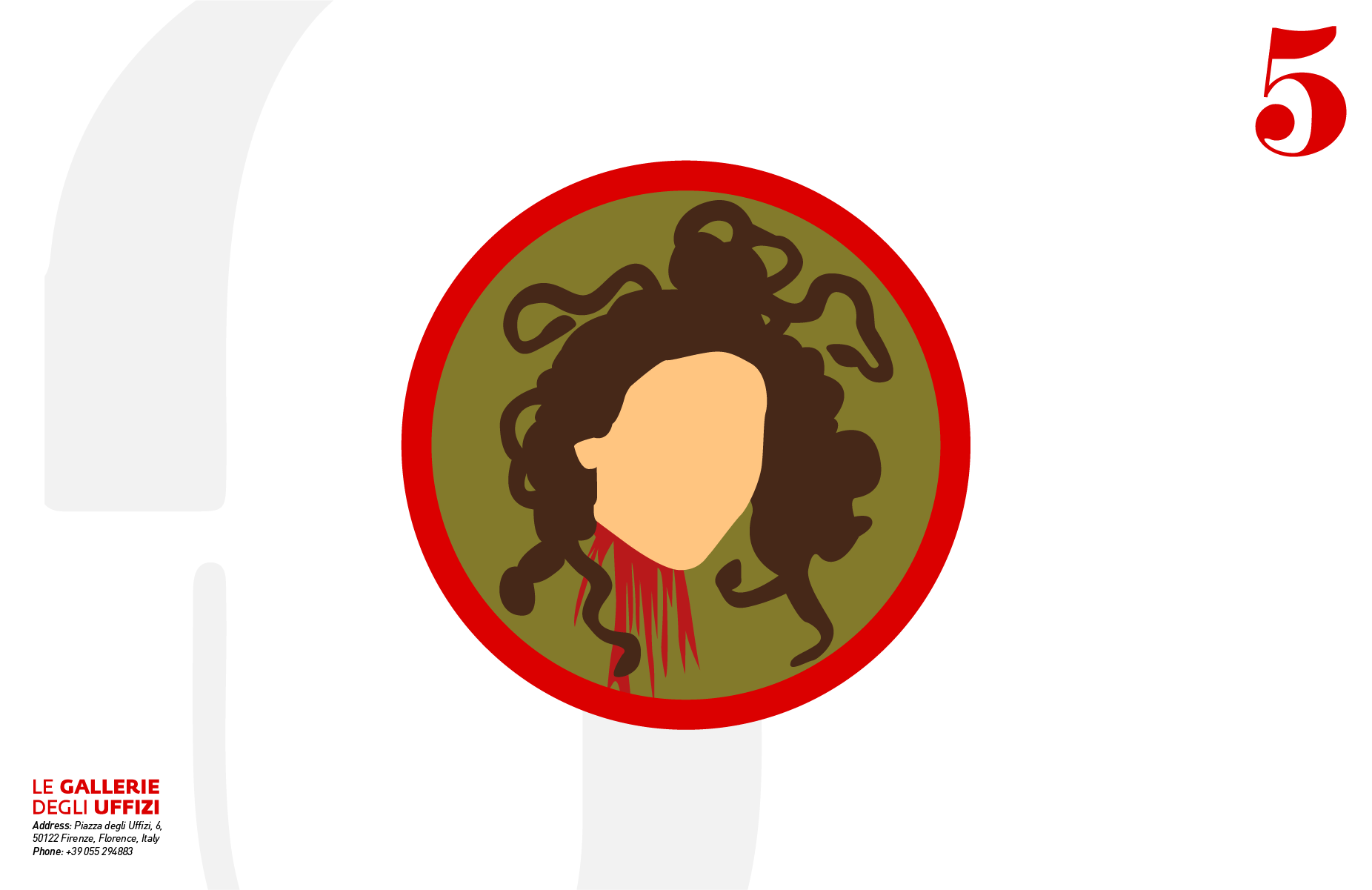
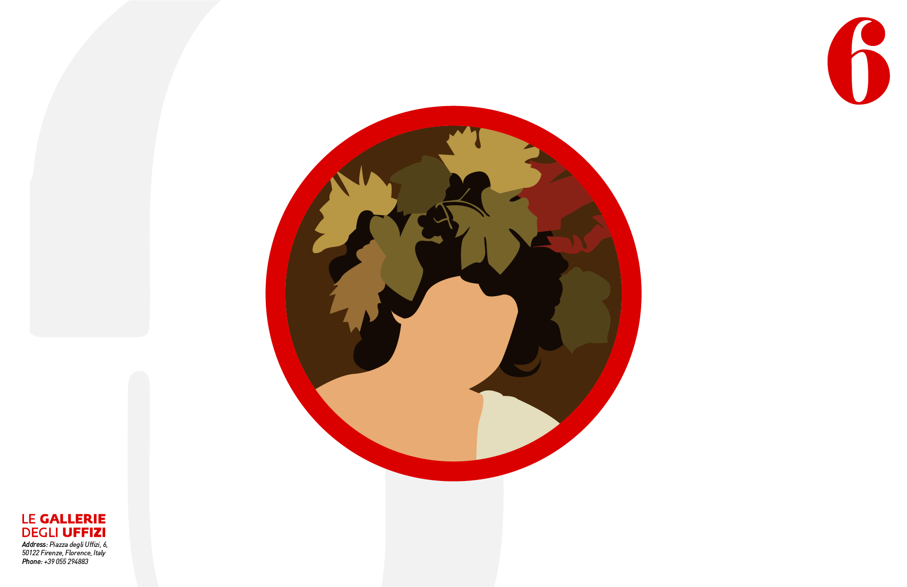
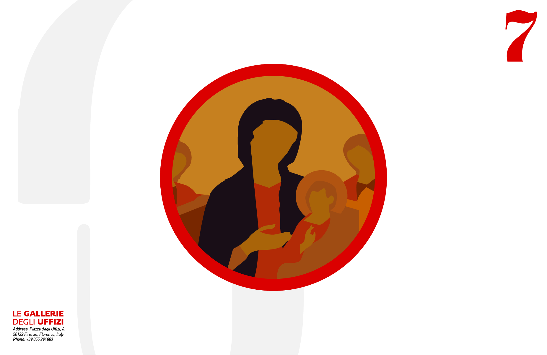
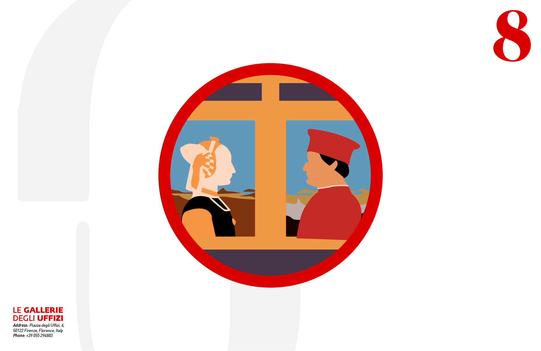
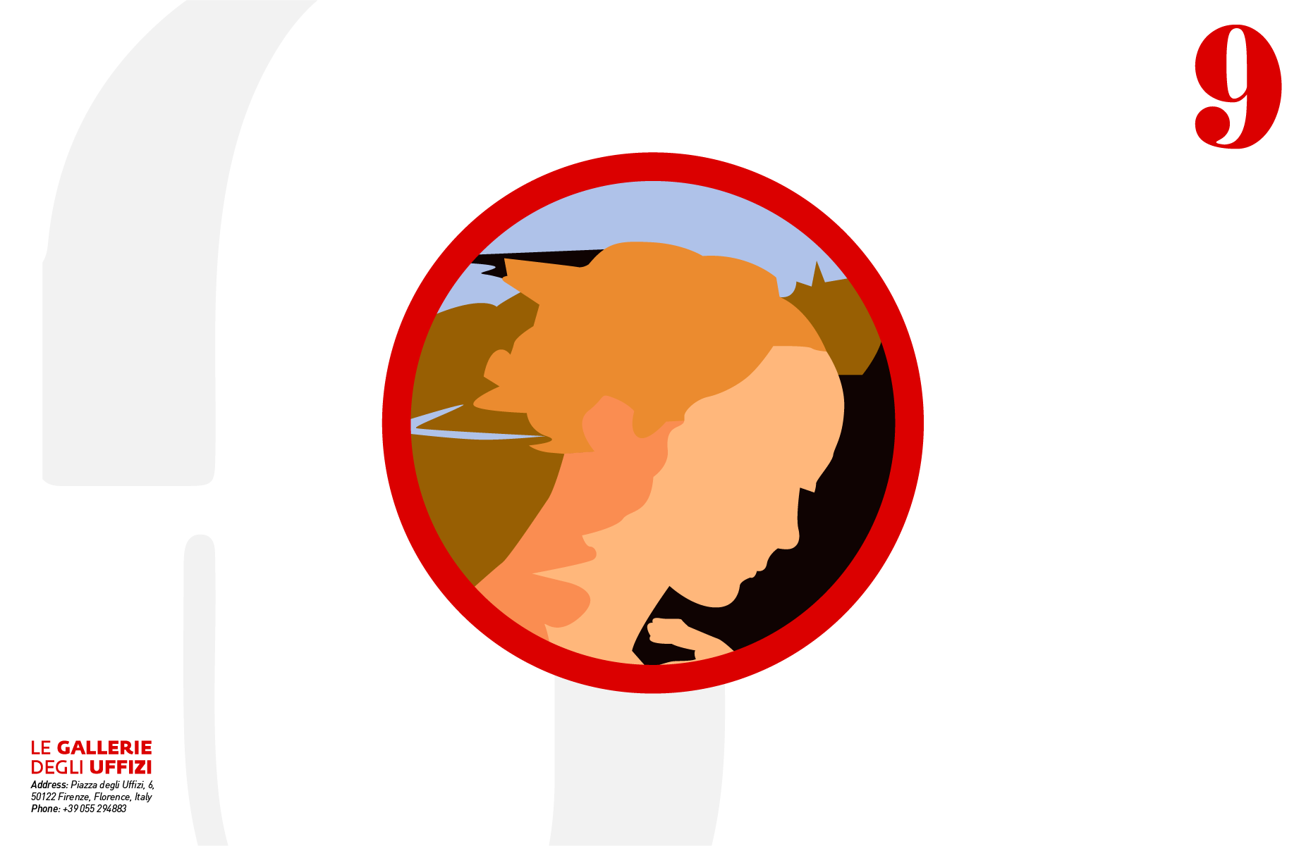
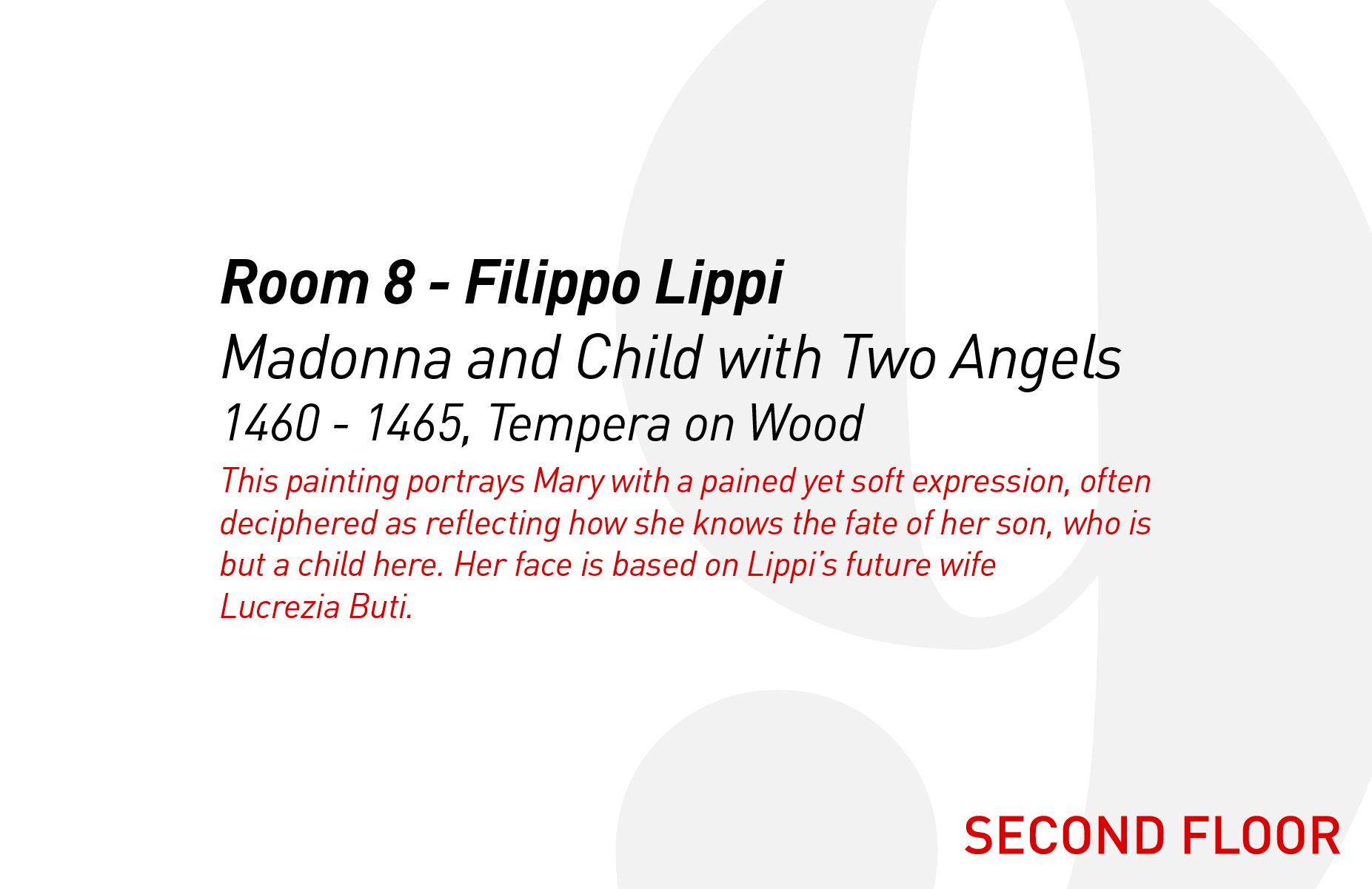
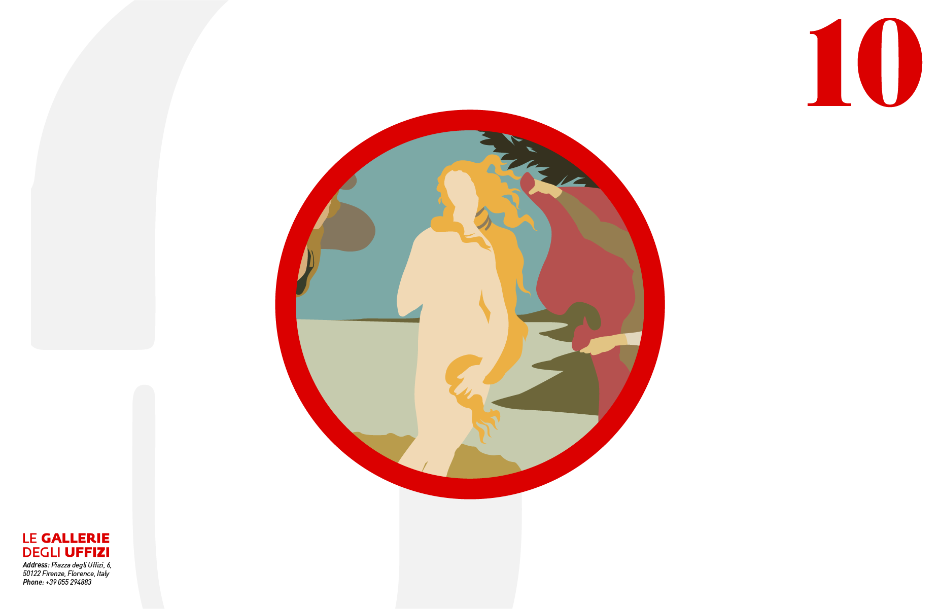
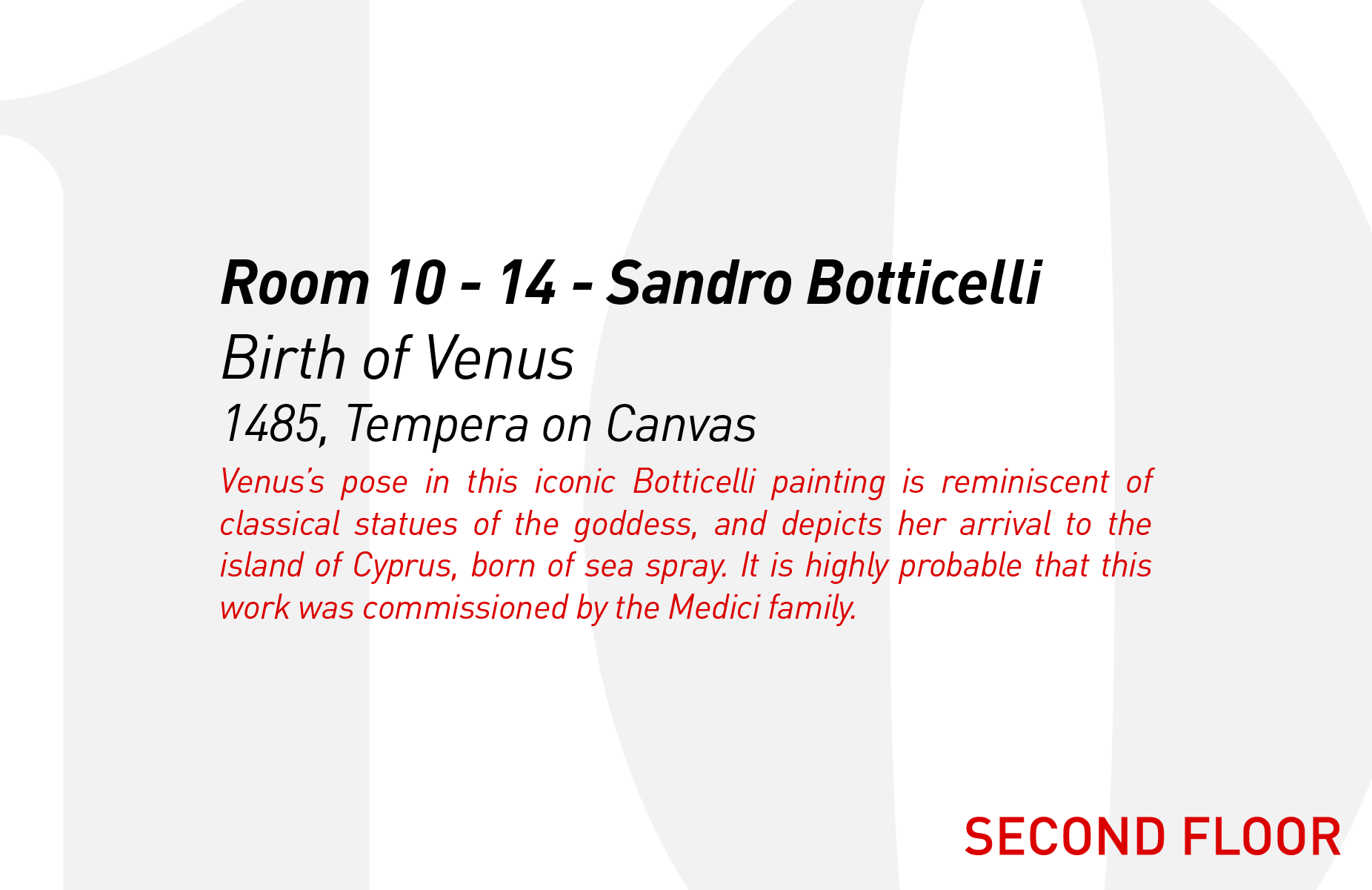
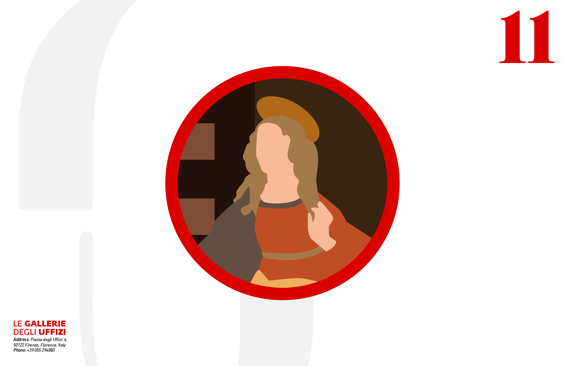
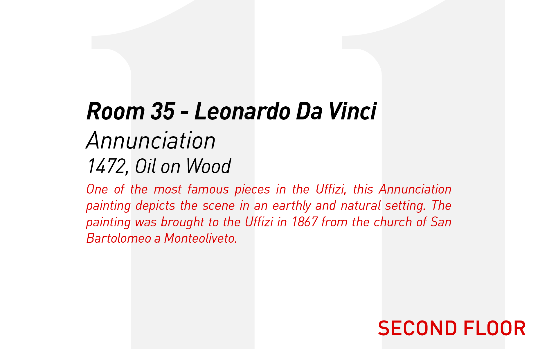
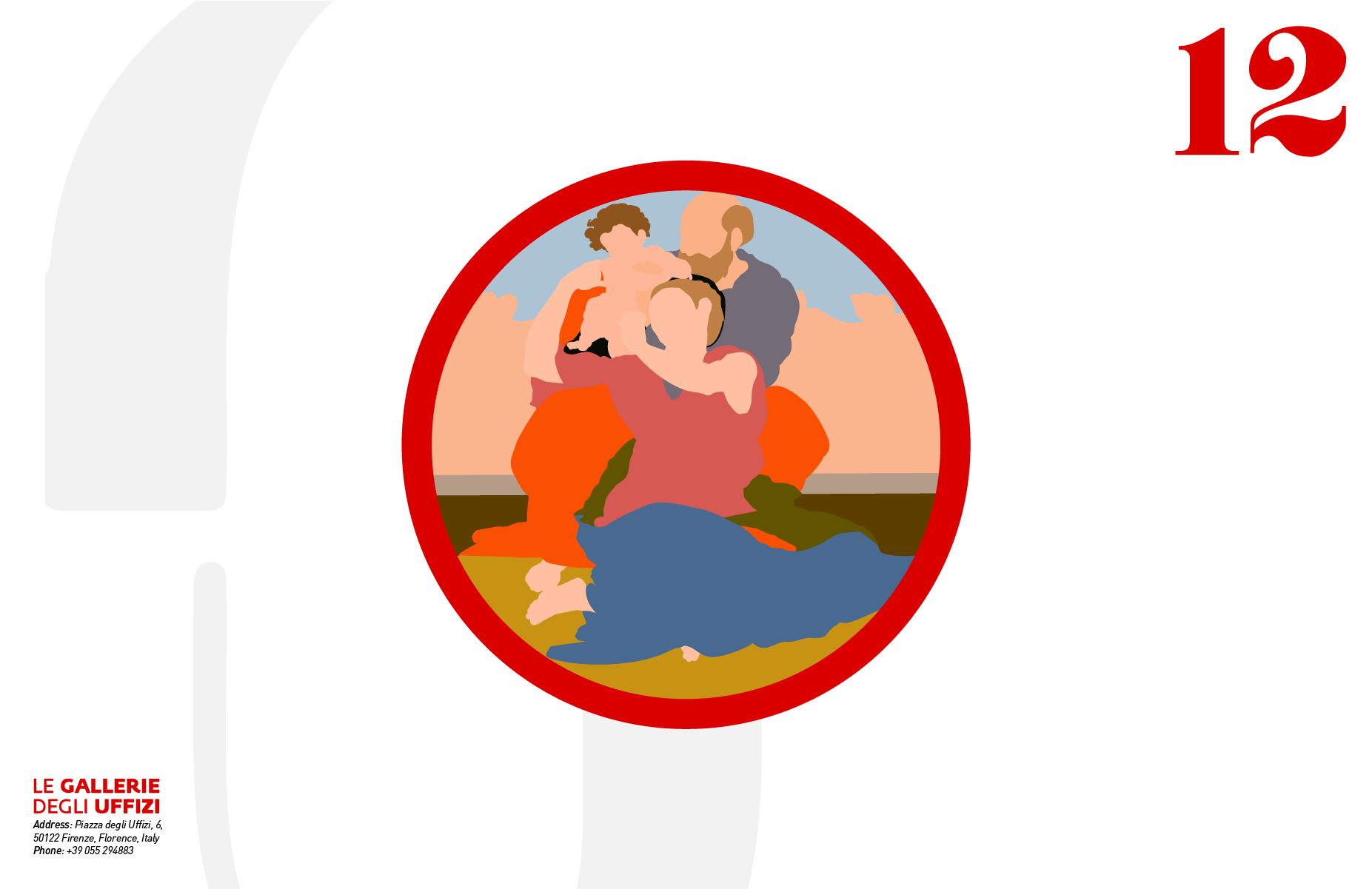
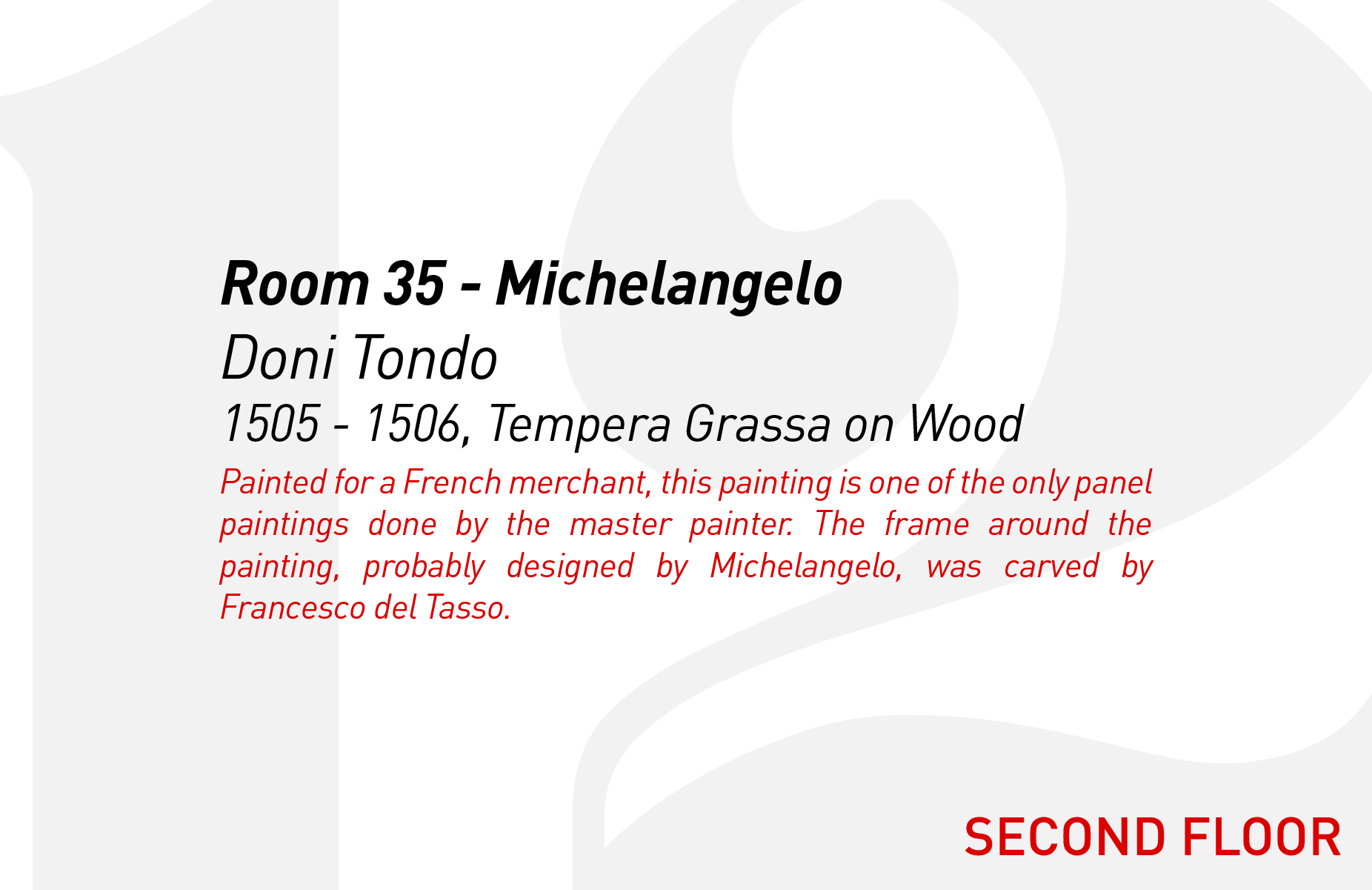
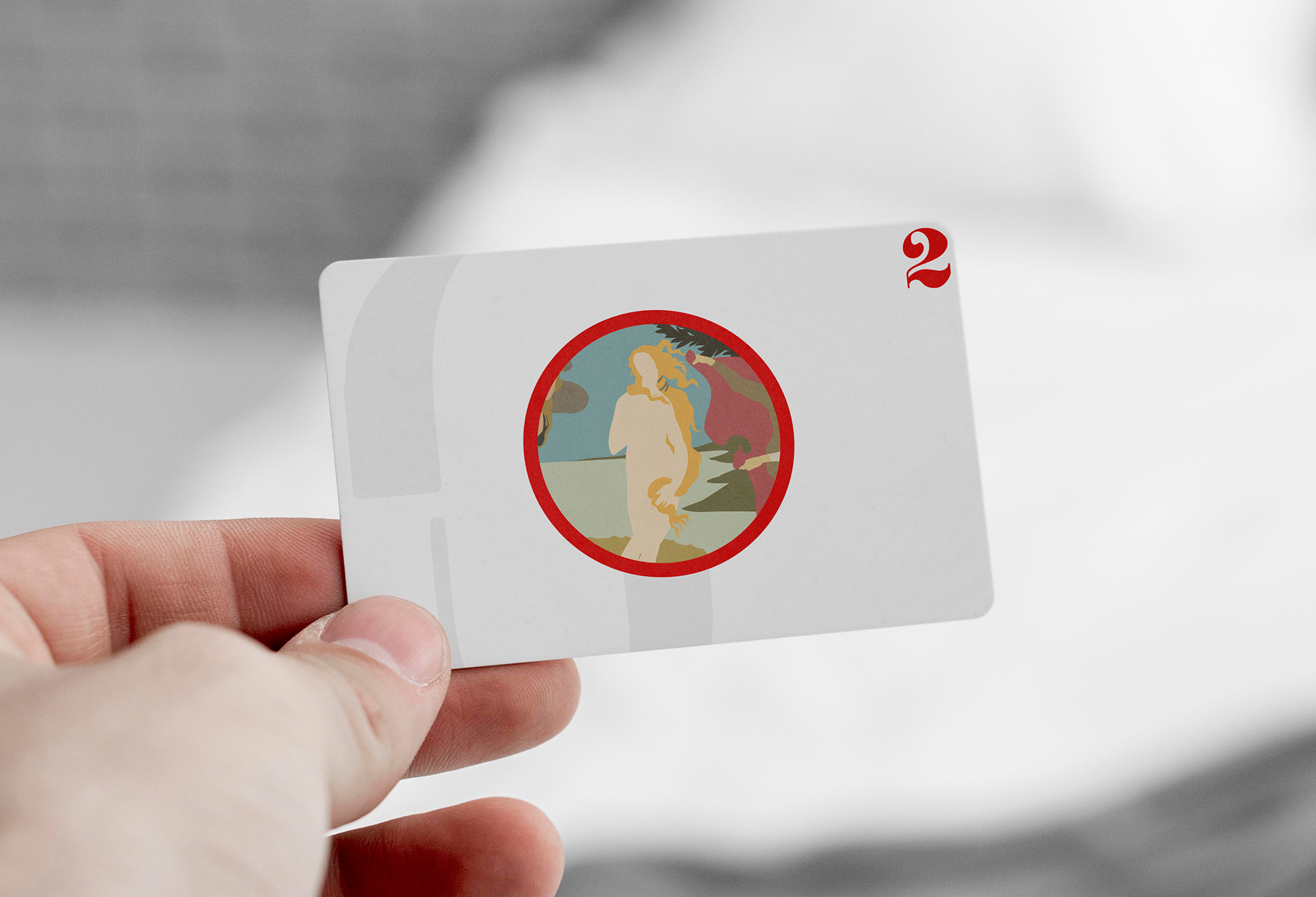
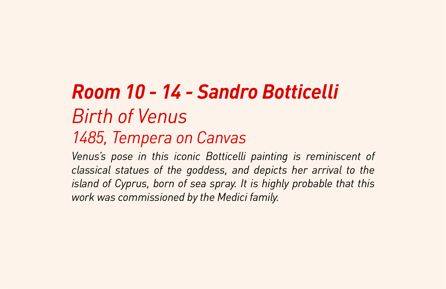
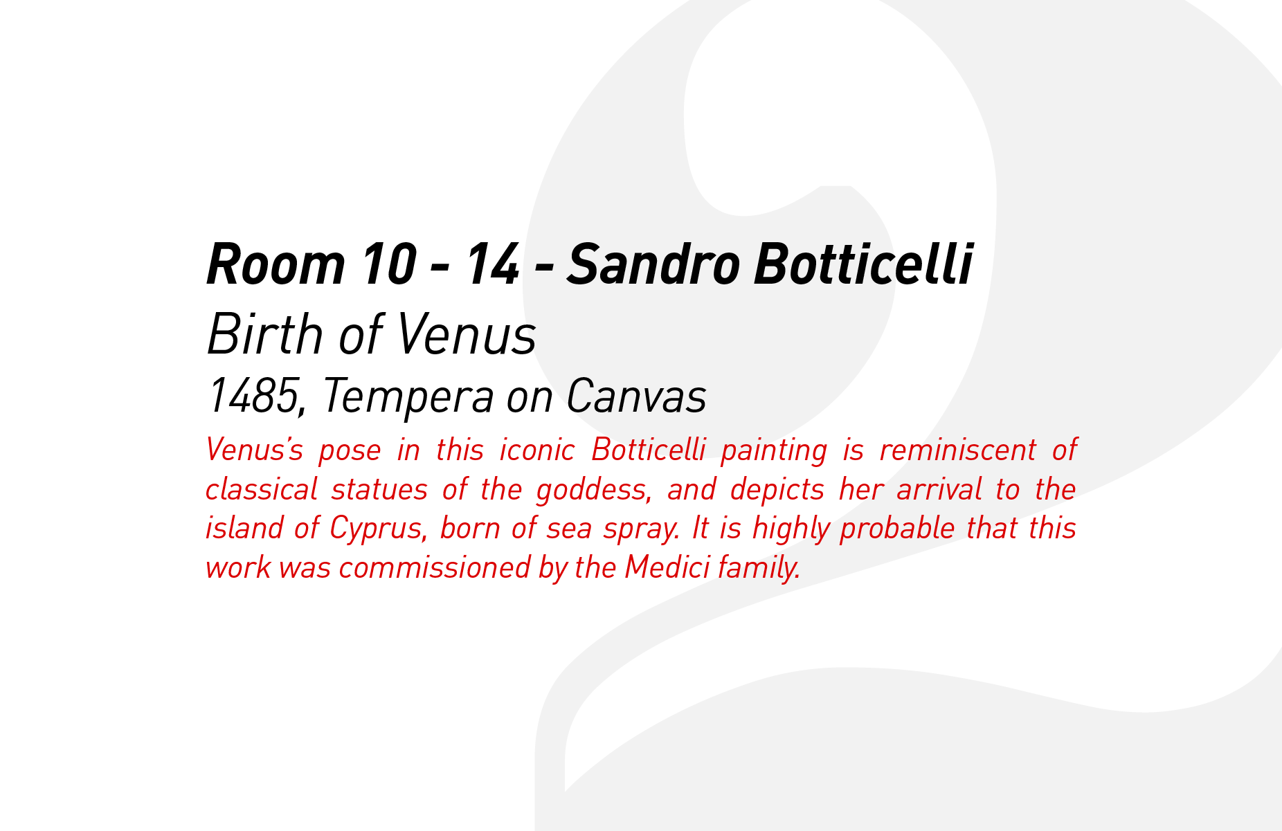
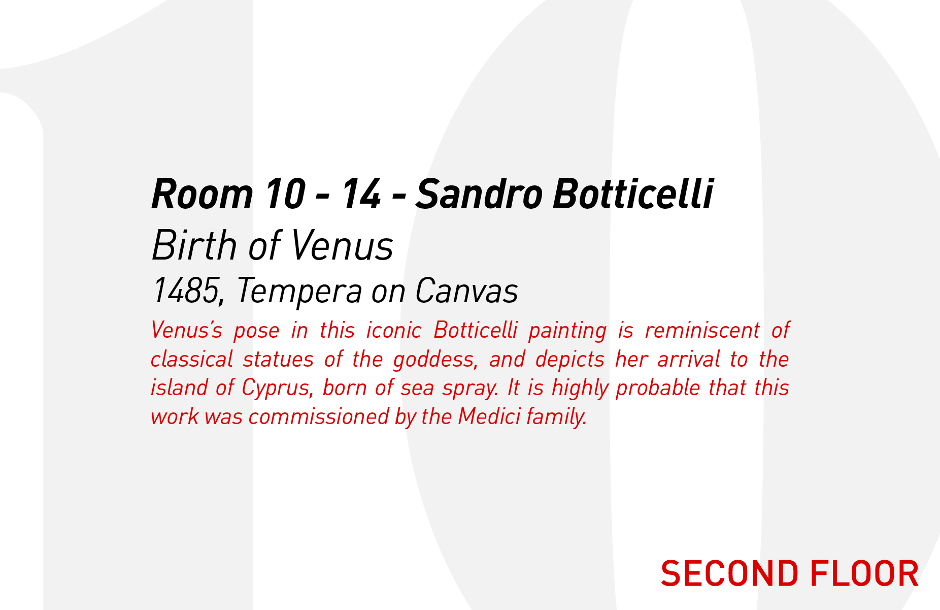
I chose 12 artworks, 6 on each floor, to use as my ‘Landmarks’ for the project.
PROCESS 3: PLANNING
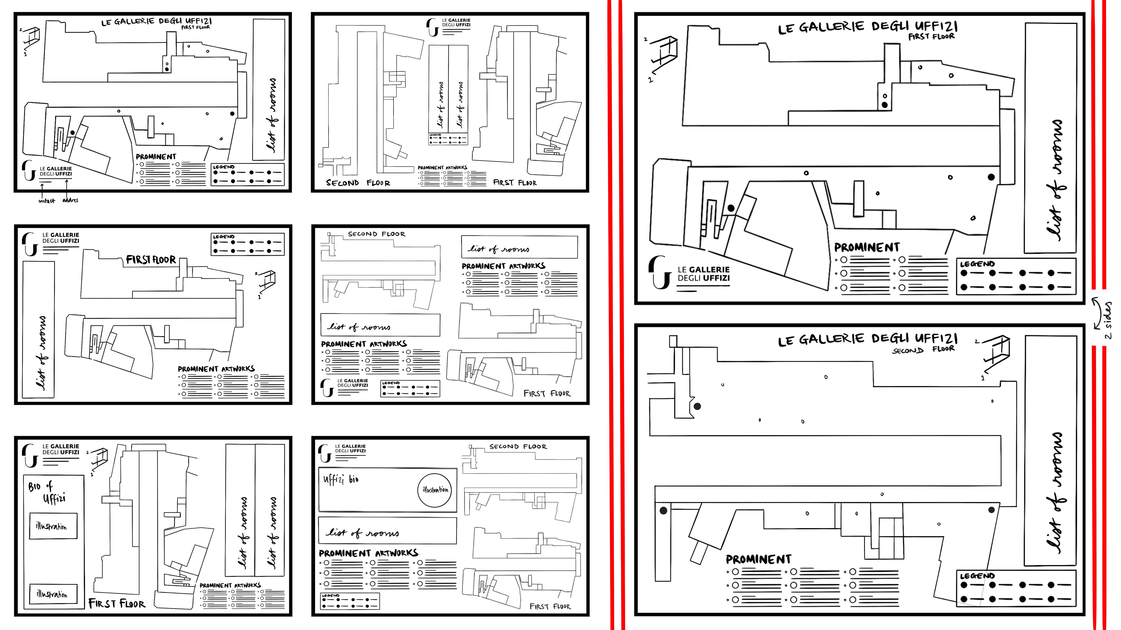
Above, on the left, are all my initial map layout sketches. I had been considering layouts with either one floor or both, and so I decided to try out both for my sketches. The layouts in the first column are of just the first floor, while the layouts in the second column have both floors. Before this point, I wasn’t sure if I would be doing just the first floor or if I would be doing both, and I think that doing these sketches really helped me decide on doing both. I think I will be doing a double sided map with one floor on each in order to give both their own attention and space, and to not cramp the important information too much.. My other favorite layout is the middle layout in the second column, which has both floors on the same side. I will be trying both these ideas out on an Illustrator document to see if the idea with two looks too cramped, and go from there.
The icons took a while as I wanted them to be relatively cohesive, and eventually settled on a recurring hand symbol for the main icons. These are just sketches and have to be done professionally, but the constant hand symbol will hopefully create cohesion in my map’s overall layout. I tried out a plethora of ideas for the Restroom sign, and ended up choosing the toilet paper roll as I had previously anticipated.
I got feedback from my Professor at this point that the hands were blocking the main elements of some of the icons, especially the Restroom, Cafeteria, and Ticket signs, so I decided to reduce their size in my more finalized icons, which can be seen below. Here, the illustrations for each of the 12 artworks can also be seen in better detail.
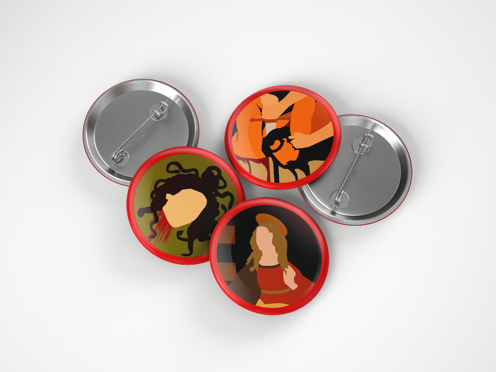
The icons for the painting collectibles are some of my favourite parts of this project. They added a level of interest that I felt my initial layouts lacked, and opened up the opportunity to expand this project from just map creation.
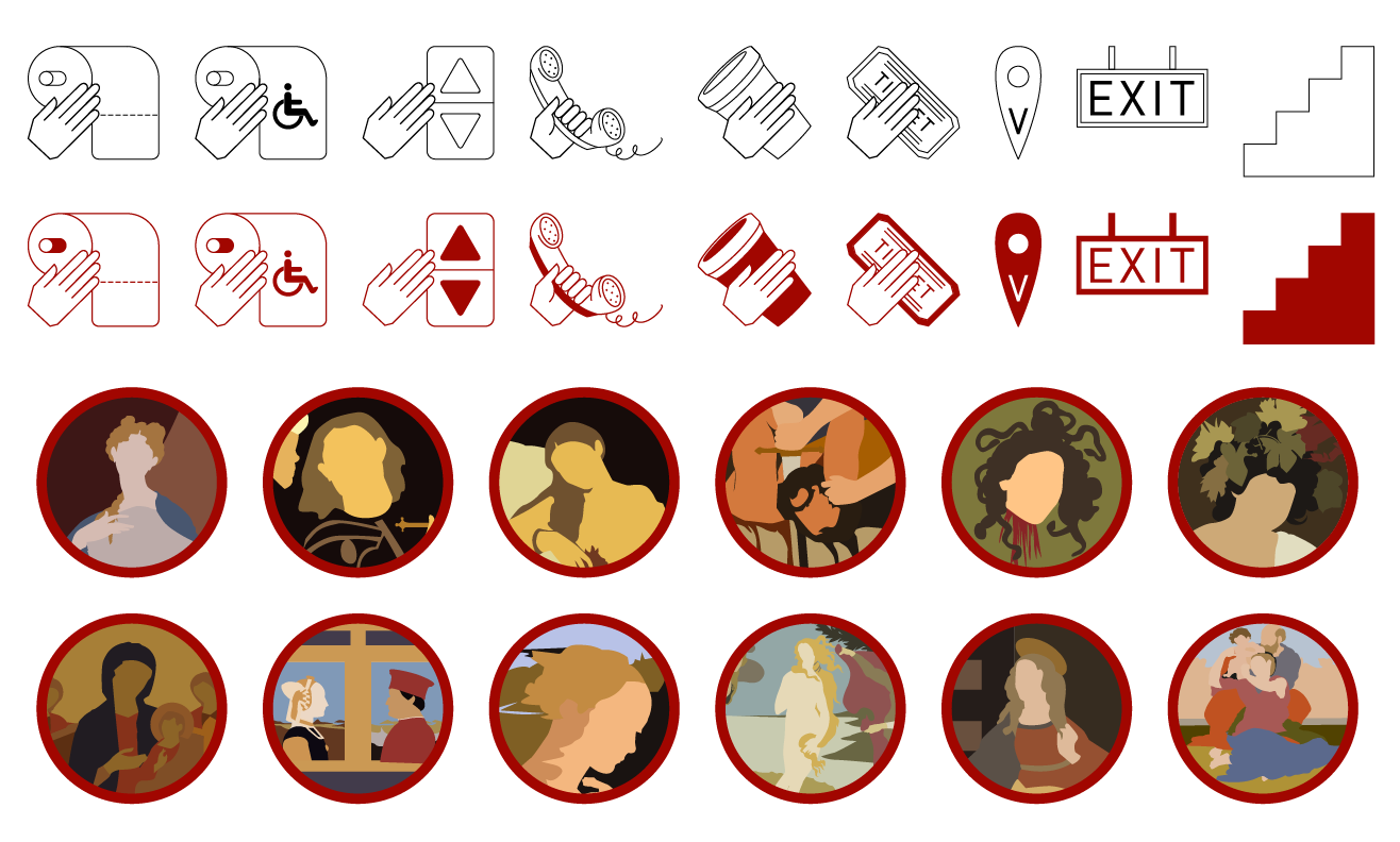
Final Icons for the Map of The Uffizi Gallery
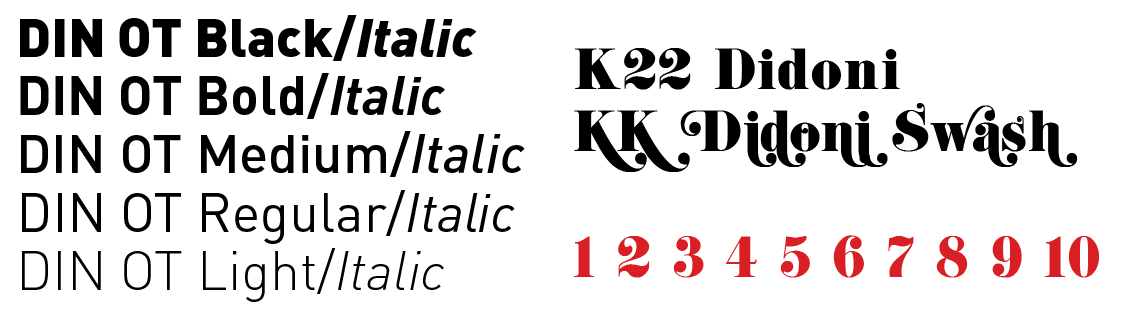
At this point in the semester, I had identified the fonts that I enjoy using, and so I decided to stick with them for this project too to continue the progression, and have some level of cohesion to all my projects. I chose DIN OT as my base text for the whole map, as well as K22 Didoni as my secondary font for more decorative elements.
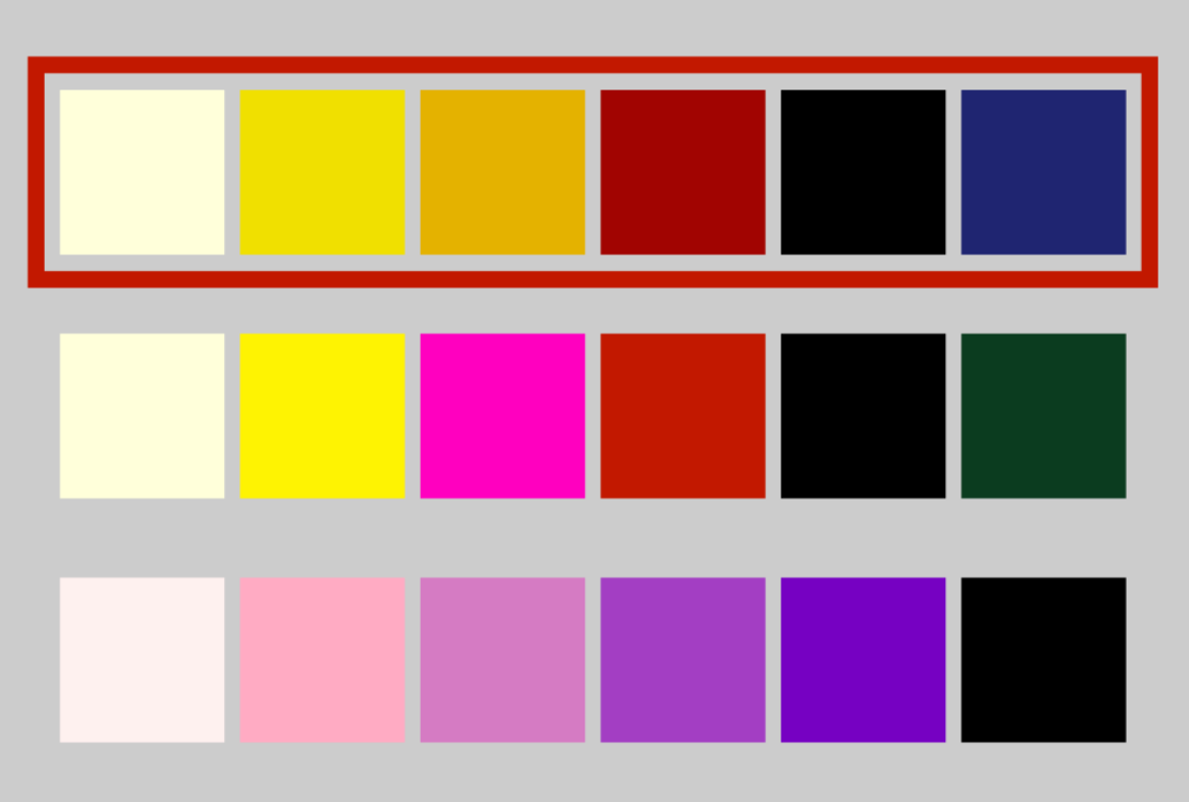
In terms of colour composition, I was thinking of using a off white colour for the ‘paper’ (background), with a very deep blue as the colour of the main lines and text, and red and yellow/gold embellishments. The idea is to mimic pieces within the Uffizi, and to match how grand the museum looks on the inside. Above are the different colour palettes I considered, and the one I chose is highlighted in red.
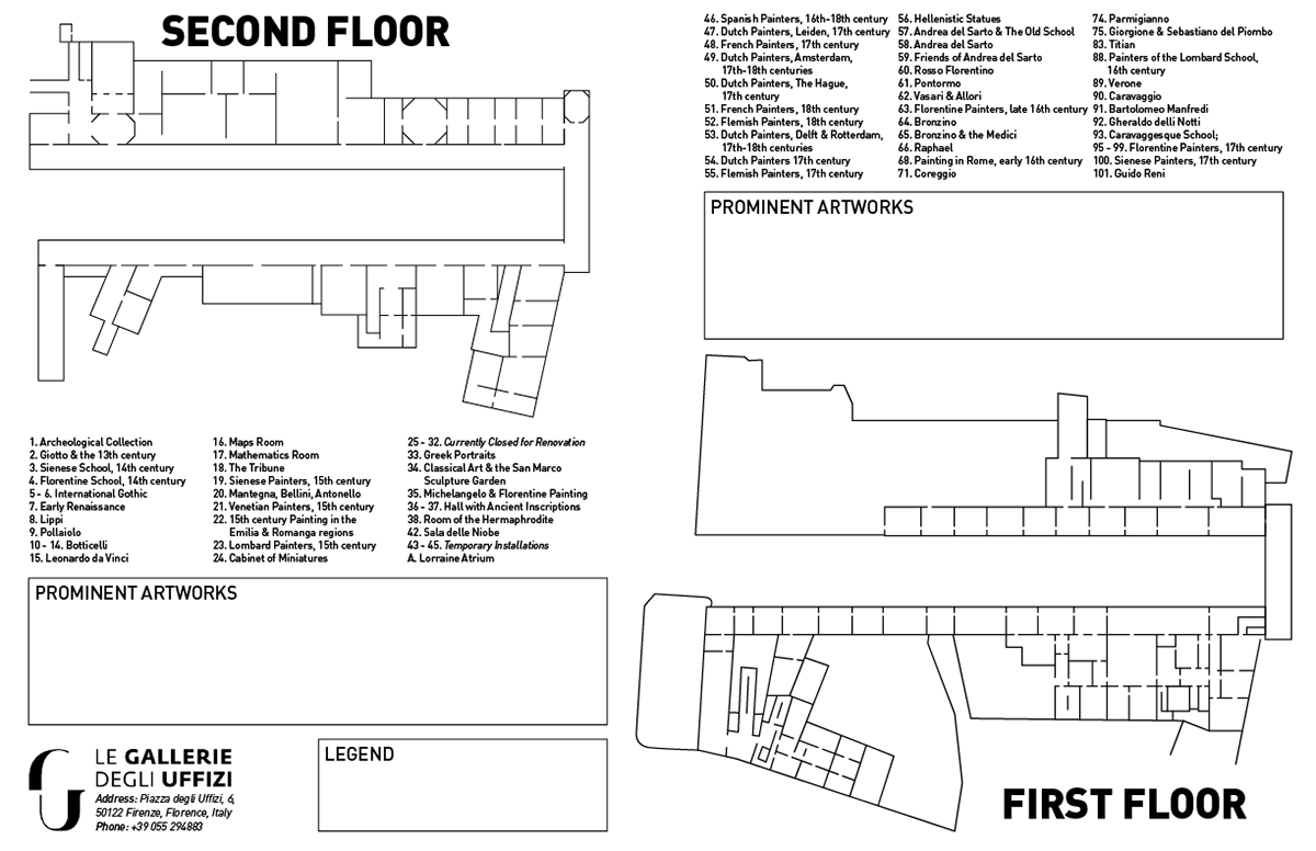
I decided to try out both the layouts I had liked from my sketches. I felt that the back-to-back full page layouts of the two floors were the better idea, but I wanted to try putting them onto the same page anyway to see how that would look and feel. I realized that having them on the same page felt a little too cluttered. The first floor has a lot (a LOT) of rooms, and putting them in 3 columns, even at 10pt felt hard to read.
Above is three consecutive weeks of working on my layout.
I realized my original colour palette wasn’t quite working once I applied it to my map. The blue felt out of place, so I decided to stick to yellow, red, and black for my final colour palette. I also replaced the embellishment in the top corners of each page with the floor number. I wasn’t very happy with my map in earlier weeks, but the more I narrowed the colour palette and focused on the design, the closer it got to my original hopes.
I do think there is a lot of information on each side, but everything except the ‘About the Uffizi’ and ‘About Florence’ sections are vital information that cannot be removed, and those add a little more authenticity to the idea of map in my opinion.
First Trial of Collectible Cards
First Trial of Collectible Cards
Second Trial of Collectible Cards
Second Trial of Collectible Cards

Final Version of Collectible Cards
Final Version of Collectible Cards
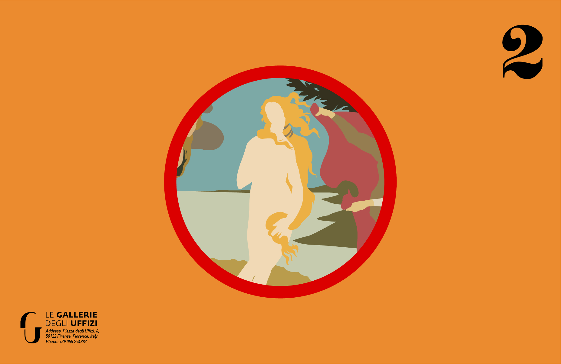
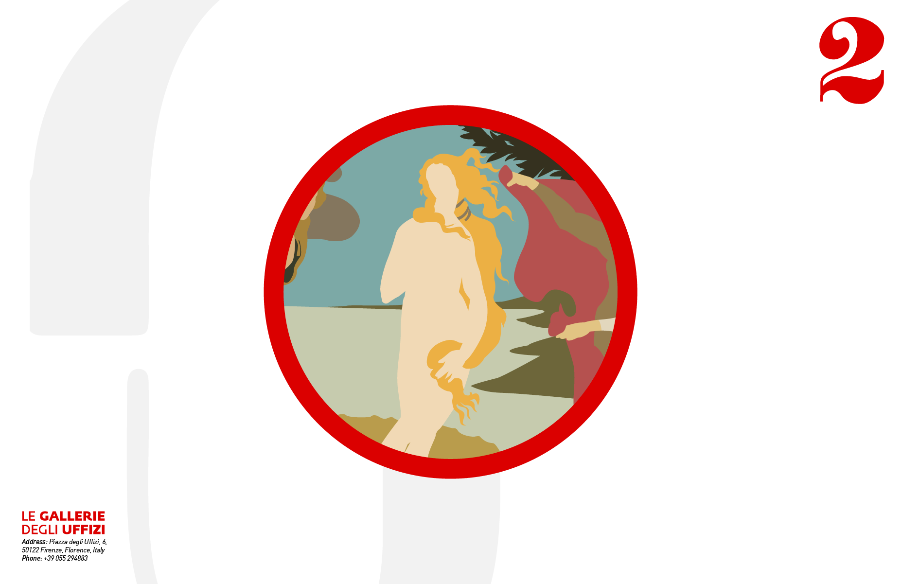
I also created Painting Collectibles, that could go along with the map and be a sort of memento for visitors. I had done a bunch of research on the 12 prominent artworks I included in my map, but felt that that went to waste because none of it was being used, and the icons were so tiny that it felt like I had put too much effort for no reason. This was a way to add an extra level to my work while also utilizing all the work I had put into this project. I found a few business card mockups that I wanted to use for the project, and based my card measurements off of that.
After the first iteration, when I was finalizing the layout of my map, I decided to avoid the 12 different colours I was using for the background, as I felt that it really didn’t go with the map design at all. Instead I played with the opacity and scale of the more graphic elements of the map and I feel like this makes it more related to the original map while also being nice collectibles that people can hold onto and maybe even put up as postcards. I also changed the design slightly from the second version (first row third image, second row first image) to the third (second row second and third images) after receiving feedback from my professor, in order to make the cards more of a collectible and more accessible to collectors!
FINAL IMAGES
My final map designs are at the very top of this project, and can be seen the clearest there.
Below: Both sides of each Illustrated Painting Collectible created as an accompanying collectible to the main map design